Add a Text Box Widget
About this task
Use the Text Box widget to add an area to the widget where app users can enter text.
Procedure
- In the Canvas, open the Widgets tab.
- Drag and drop the Text Box widget onto the app canvas.
- In the Text Box Properties panel, enter a name for the widget in the Name field.
- Optional:
Enter hint text in the Display text field indicating the
type of text content to enter in the text box.
The display text disappears when the app user begins to enter text.
-
Turn on other text box settings.
Multi-line App users can enter multiple lines of text in the text box, such as the body of an email message. Required App users must enter text into the text box. Read-only App users cannot add or edit text in the text box. This option is enabled automatically if Use as Barcode is selected. Use as Barcode The contents of the text box can be used as a barcode. Use the Select barcode formats dropdown that appears to choose the appropriate formats. Note: You must select On Scan from the Events tab when using this option. On Blur is not available if this option is selected.You can configure multiple actions, but Map scanned value must be the first.
- In the Text Formatting section, change the default formatting settings for text.
-
In the Widget Alignment section, choose how you want to
align your widget in the app.
- Align Left
- Center
- Align Right
- Optional:
In the Rules section, add a requirement rule to the
widget.
Use requirement rules to specify whether the app user must configure this widget or can skip it.
- Select Requirement Rule to open the Set Requirement Rule dialog box.
- Select whether the requirement rule requires meeting all or any conditions.
- From the Field list, select an app field or variable and an operator. Enter the value required for the widget to be visible.
- Select Add Condition to add another condition.
- Select OK to save.
- Optional:
In the Rules section, add a visibility rule to the widget.
Use visibility rules to control when a widget is visible to the app user. For example, you can create a condition that a widget should only appear after the app user fills in a field or submits a form.
- Select Visibility Rule to open the Set Visibility Rule dialog box.
- Select whether the visibility rule requires meeting all or any conditions.
- Select an app field or variable and an operator from the Field list. Enter the value required for the widget to be visible.
- Select Add Condition to add another condition.
- Select Save.
-
Choose a validation for the text box.
Option Description Text This option accepts any character type. Define the validation further by selecting the Data Subtype:
Subtype Sub-options No selection - Range: Specify the minimum and maximum text sizes for the field.
- Error Message: Accept the default or provide an error message for the user when the Range requirements are not met.
Email Address - Error Message: Accept the default or provide an error message for the user when an incorrect email address is entered.
Number This option limits text box content to numeric characters only. Set the Number Format using the following sub-options:
Tip: Refer to the Sample Text to preview how the text will appear.Set Condition to restrict the values entered using the following sub-options:- Symbol: Set an alphabetic or special character if the number requires a symbol (e.g., $)
- Placement: Use the Symbol as a prefix in front of the number or a suffix at the end.
- Group Separator: Choose from a list
of separators to improve readability:
- None
- Comma (,)
- Period (.)
- Apostrophe (')
- Space ( )
- Position: Choose from a list of
positions to place the Group
Separator:
- 100s
- 1000s
- 10000s
- Decimal Separator: Choose from a list
of separators to represent a decimal:
- None
- Comma (,)
- Period (.)
Note: You cannot use the same character for both Group Separator and Decimal Separator. - Places: Define the number of decimal places to display from 1 to 10.
- Select: Default. No option is selected.
- Greater Than: Number values must be greater than a specific Number.
- Less Than: Number values must be less than a specific Number.
- Equal To: Number values must be equal to a specific Number.
- Not Equal To: Number values must not equal a specific Number.
- Range: Number values must be between the minimum (Min.) and maximum (Max.) values.
- Not in Range: Number values must be outside the minimum (Min.) and maximum (Max.) values.
- Error Message: Accept the default or provide an error message for the user when a number does not meet the Condition.
Password This option hides characters as they are typed, displaying an asterisk (*) instead. App users can choose to hide or show the true characters.
Regular Expression (Regex) Custom validation formats can use regular expressions (regex). For details on regular expressions, their uses, and construction, see https://en.wikipedia.org/wiki/Regular_expression.
- Regular Expression: Provide the
regular expression to use for text validation.
Examples of regular expressions:
- Email
address:
^[\w\-\.\+]+\@[a-zA-Z0-9\.\-]+\.[a-zA-Z0-9]{2,4}$ - Phone number (10 numbers with brackets and dashes
optional):
/^\(?(\d{3})\)?[- ]?(\d{3})[- ]?(\d{4})$/ - Date (M/D/YYYY or D/M/YYYY):
/^[0-9]{1,2}\/[0-9]{1,2}\/[0-9]{4}$/
- Email
address:
- Error Message: Accept the default or provide an error message for the user when their input does not meet the regex condition.
- Optional:
In the Miscellaneous section, decide which name you want
to appear in the widget report.
The Same as widget name setting is the default selection and automatically uses the widget name as the chart title. To choose your own chart title, clear the option and enter a new name.
You may use special characters except for
%&<>{}*|^and double spaces. - Move to the Format tab to customize the widget's appearance.
- Optional:
Add events and actions to the widget.
Events are activities that you can set to trigger an Action. For example, you can configure a widget to navigate to a new section in the app when the user selects it.Important: Events and actions offer a wide range of combinations. The following steps are guidelines only. Replace the listed events and actions with ones that suit your app's needs and structure. Learn more about available events and actions at Events and Actions.
-
Move to the Events tab.
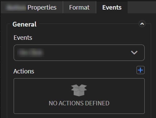
-
Move to the Events tab.
-
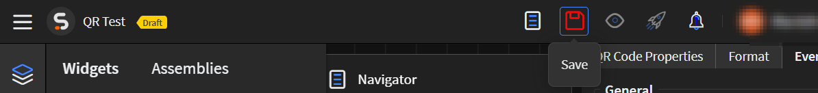
Select Save in the SOTI Snap
banner to apply your changes.