Add a Drop Down Widget
About this task
Use the Drop Down widget to add a dropdown list to your app.
Procedure
- In the Canvas, open the Widgets tab.
- Double-click or drag and drop the Drop Down widget onto the app canvas.
- In the Drop Down Properties panel, enter a name for the widget in the Name field. You can also enter a label for that will appear as the default option in the Display text field.
- Enable the Required check box if you want to force app users to select an choice.
-
Enter label text for each of the choices. Click Add beside a choice to add more choices.
You can also import the dropdown options from an external source by connecting it to a data import connection.
-
Choose how the records for this widget should appear when
exported to reports or using data export connections. To let the external source
decide them automatically, leave Default selected. If you
want to customize how they appear, clear Default and
update the Data settings: Format field to your preferred
format.
-
Expand the dropdown icon above the right corner of the field to enter
macros that represent the data in each display column. Double percentage
signs encase macros:
%%macro%%. You cannot manually enter a macro. - Enter text characters.
- Repeat to add more macros or text characters.
Do not leave the Data settings: Format field in the middle of creating your format. You could lose your work because the field reverts to the last valid format whenever you leave the field. -
Expand the dropdown icon above the right corner of the field to enter
macros that represent the data in each display column. Double percentage
signs encase macros:
-
In the Widget Alignment section, choose how you want to
align your widget in the app.
- Align Left
- Center
- Align Right
- Optional:
In the Rules section, add a requirement rule to the
widget.
Use requirement rules to specify whether the app user must configure this widget or can skip it.
- Select Requirement Rule to open the Set Requirement Rule dialog box.
- Select whether the requirement rule requires meeting all or any conditions.
- From the Field list, select an app field or variable and an operator. Enter the value required for the widget to be visible.
- Select Add Condition to add another condition.
- Select OK to save.
- Optional:
In the Rules section, add a visibility rule to the widget.
Use visibility rules to control when a widget is visible to the app user. For example, you can create a condition that a widget should only appear after the app user fills in a field or submits a form.
- Select Visibility Rule to open the Set Visibility Rule dialog box.
- Select whether the visibility rule requires meeting all or any conditions.
- Select an app field or variable and an operator from the Field list. Enter the value required for the widget to be visible.
- Select Add Condition to add another condition.
- Select Save.
- Optional:
In the Miscellaneous section, decide which name you want
to appear in the widget report.
The Same as widget name setting is the default selection and automatically uses the widget name as the chart title. To choose your own chart title, clear the option and enter a new name.
You may use special characters except for
%&<>{}*|^and double spaces. - Move to the Format tab to customize the widget's appearance.
- Optional:
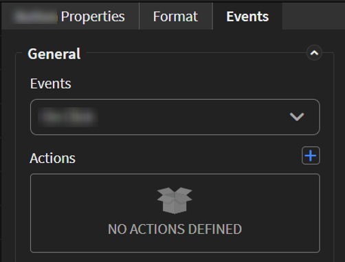
Add events and actions to the widget.
Events are activities that you can set to trigger an Action. For example, you can configure a widget to navigate to a new section in the app when the user selects it.Important: Events and actions offer a wide range of combinations. The following steps are guidelines only. Replace the listed events and actions with ones that suit your app's needs and structure. Learn more about available events and actions at Events and Actions.
-
Move to the Events tab.
-
Move to the Events tab.
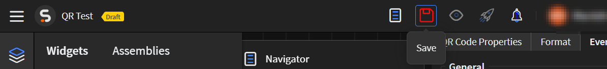
-
Select Save in the SOTI Snap
banner to apply your changes.
Results
Tip: Select Preview to see how the widget
appears in your app.