Adding a Group List Widget
Before you begin
You can only add a Group List widget in business apps.
About this task
Use the Group List widget to select at least one group (and the group's members) as dynamic approvers in a business app.
Procedure
- In the Canvas, open the Widgets tab.
-
Double-click or drag the Group List widget onto the app
canvas.
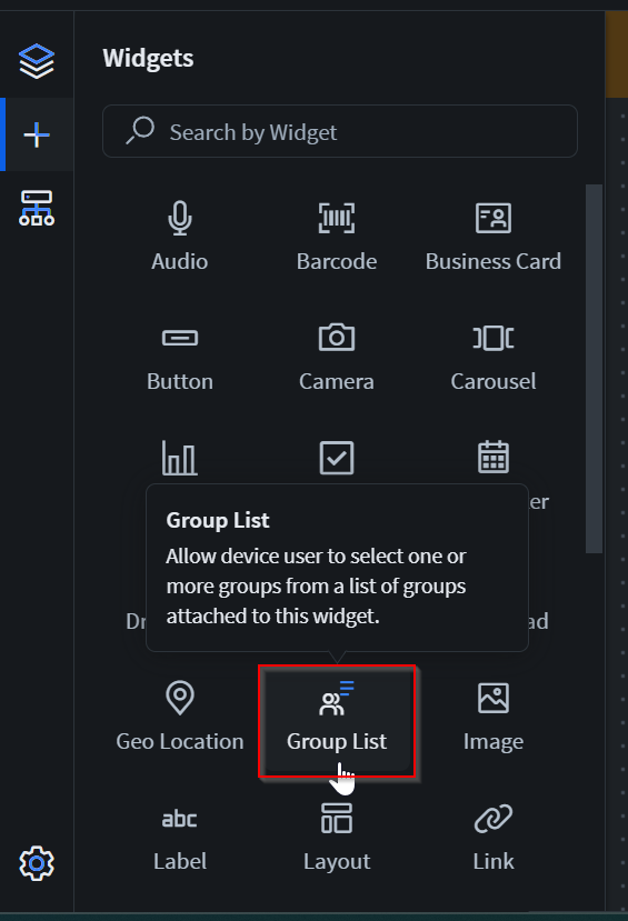 The Group List Properties panel displays on the right with its sections.
 -
In the General section, set the following fields:
-
In the Groups section, set the groups that the device app
user may select:
Note: You must specify at least one group.
Option Description Allow All Groups
Available options are: - Turn on to make groups selectable.
- Turn off to set specific groups as selectable.
List Of Selectable Groups
Search and select an user group to populate the group list. Note: You can only select active groups. -
In the Widget Alignment section, choose how you want to
align your widget in the app.
- Align Left
- Center
- Align Right
- Optional:
In the Rules section, add a requirement rule to the
widget.
Use requirement rules to specify whether the app user must configure this widget or can skip it.
- Select Requirement Rule to open the Set Requirement Rule dialog box.
- Select whether the requirement rule requires meeting all or any conditions.
- From the Field list, select an app field or variable and an operator. Enter the value required for the widget to be visible.
- Select Add Condition to add another condition.
- Select OK to save.
- Optional:
In the Rules section, add a visibility rule to the widget.
Use visibility rules to control when a widget is visible to the app user. For example, you can create a condition that a widget should only appear after the app user fills in a field or submits a form.
- Select Visibility Rule to open the Set Visibility Rule dialog box.
- Select whether the visibility rule requires meeting all or any conditions.
- Select an app field or variable and an operator from the Field list. Enter the value required for the widget to be visible.
- Select Add Condition to add another condition.
- Select Save.
- Optional:
In the Miscellaneous section, decide which name you want
to appear in the widget report.
The Same as widget name setting is the default selection and automatically uses the widget name as the chart title. To choose your own chart title, clear the option and enter a new name.
You may use special characters except for
%&<>{}*|^and double spaces. - Move to the Format tab to customize the widget's appearance.
- Optional:
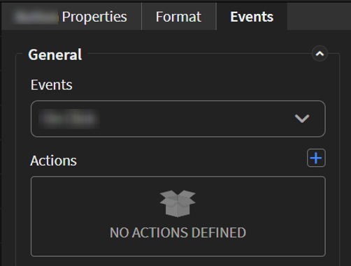
Add events and actions to the widget.
Events are activities that you can set to trigger an Action. For example, you can configure a widget to navigate to a new section in the app when the user selects it.Important: Events and actions offer a wide range of combinations. The following steps are guidelines only. Replace the listed events and actions with ones that suit your app's needs and structure. Learn more about available events and actions at Events and Actions.
-
Move to the Events tab.
-
Move to the Events tab.
-
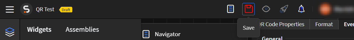
Select Save in the SOTI Snap
banner to apply your changes.
Results
Tip: Select Preview to see how the widget
appears in your app.