Add a Carousel Widget
About this task
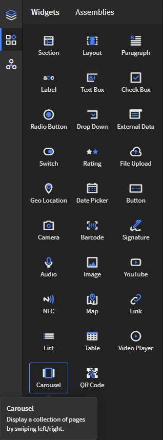
Use the Carousel widget to display a collection of application pages in a rotating sequence. With user intervention, the user may swipe back and forth through a series of pages or allow the widget to autoscroll at a timed interval.
Procedure
- In the Canvas, open the Widgets tab.
-
Drag the Carousel widget onto the app canvas.

- In the Carousel Properties panel, enter an ID and Name for the widget, or keep the defaults.
-
In Carousel Items, decide the number of pages for
rotation. By default, the Carousel widget creates two
pages. Select
Add to add a new page or use the copy button to copy a previous page. Drag
pages into the desired order.
-
Change Carousel pages by adding applicable widgets (for
example, labels, images).
Note: The Carousel widget is read-only. For example, at runtime, you cannot enter information into a text box on a Carousel page.Note: Some widgets, such as the Video Player and YouTube widgets, do not work within the Carousel's pages.
-
In Carousel Settings, set the following details that
govern the look and feel of how the Carousel
scrolls:
Option Description Autoscroll Scrolls the Carousel without user intervention after launch. Autoscroll Timing (Sec) Sets the speed of autoscrolling in seconds. This option is only available if Autoscroll is selected.
Scroll Direction Sets the direction of scrolling for the Carousel (left or right). Arrow Style Sets the style of the arrow used for user interaction when scrolling either left or right. You have the option to select no arrow style (none). - In Background, select the Color Scale to determine your Carousel's background color, if any.
- Optional:
In the Rules section, add a visibility rule to the widget.
Use visibility rules to control when a widget is visible to the app user. For example, you can create a condition that a widget should only appear after the app user fills in a field or submits a form.
- Select Visibility Rule to open the Set Visibility Rule dialog box.
- Select whether the visibility rule requires meeting all or any conditions.
- Select an app field or variable and an operator from the Field list. Enter the value required for the widget to be visible.
- Select Add Condition to add another condition.
- Select Save.
-
Select Save in the SOTI Snap
banner to apply your changes.

Results
Tip: Select Preview to see how the
widget appears in your app.