About this task
Use the Chart widget to display a visual relationship between
data.
Procedure
-
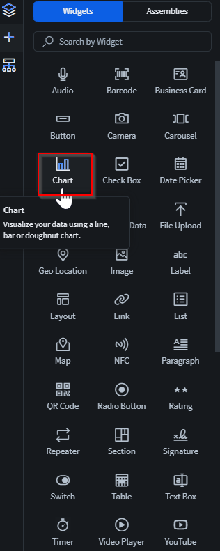
In the Canvas, open the Widgets tab.
-
Double-click or drag and drop the Chart widget onto the
app canvas.
The Chart Properties panel displays on the right
with its sections.
-
In the Chart section, set the following fields:
-
Enter an ID and Name for
the widget or keep the defaults.
-
In the Configure Chart section, select
Configure Chart to launch the Configure
Chart dialog box.
-
Open the Chart Formatting.
-
For the Type option, select the chart type
- Column Chart
- Bar Chart
- Pie Chart
- Line Chart
-
For the Title field, enter a title for the chart
type. You can also select Aa to apply
Title Formatting.
-
Toggle the Data Label checkbox to present more
details for each of the data values.
- Column/Bar/Line Chart: Display the exact numerical values for
each data point/bar.
- Pie Chart: For each of the pie chart slice, display the slice's
category next to the slice.
-
Toggle the Legend checkbox to present more
details for the entire set of data.
- Column/Bar/Line Chart: At the bottom of the chart, display each
of the selected Series field.
- Pie Chart: At the bottom of the chart, display all possible
values for the Series field.
-
For the Source Selection selection, select the
source of the data used by the chart. Choose from:
-
For the Label field, select the data field that
represents the independent variables aspect of the chart. You can select
both number-based and character-based data fields.
-
For the Series field, select the data field that
represents the dependent variables of the chart. You can only select
number-based data fields.
Restriction: For non-Pie Charts, you can select up to 5
Series. For Pie Charts, you may only select
1 Series max.
-
Toggle Data Grouping to
group identical Label data values together to
cluster and transform the Series field 's value
with the following aggregate functions:
-
Toggle Plot As Distinct
Values to transform the Series
field 's value without any clustering and display each of the
constituent Series values
Restriction:
- This option is only available after you enabled
Data Grouping.
- This option is not available for Pie Charts.
-
For the Series Title field,
enter a title for the Series field.
-
Use Data Filtering to
dynamically transform the entire chart to see only a subset of all data
values. Select to add new filtering
rules to extract the exact subset you want.
-
Select Save to finish configuring the
chart.
-
In the Export section, set the following fields:
-
Toggle Save Chart To Report to save the chart as
part of the SOTI Snap report. Access the
report from Using Report Viewer.
-
In the Data Sync section, set the following fields:
-
Toggle Auto Refresh to automatically refresh the
chart with any updated values of Source
Selection's selected data source. You must enter an
Auto Refresh Timing (Sec) with a value of at
least 1 second.
Restriction: The
Auto Refresh toggle
is not applicable if you selected a
Data
Source for
Source Selection. To
refresh a chart using a
Data
Source, you must instead manually import the data source
file again or establish a new connection with Cloud-based data
source file again.
- Optional:
In the Rules section, add a visibility rule to the widget.
Use visibility rules to control when a widget is visible to the app user. For
example, you can create a condition that a widget should only appear after the
app user fills in a field or submits a form.
-
Select Visibility Rule to open the Set
Visibility Rule dialog box.
-
Select whether the visibility rule requires meeting all or any
conditions.
-
Select an app field or variable and an operator from the
Field list. Enter the value required for the
widget to be visible.
-
Select Add Condition to add another
condition.
-
Select Save.
-
Move to the Format tab to customize the widget's
appearance.
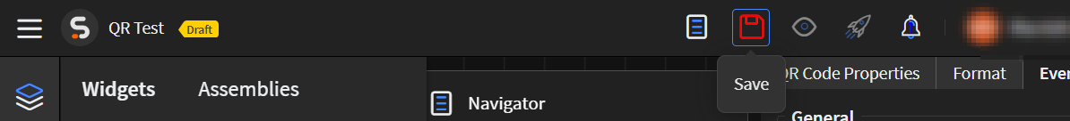
-
Select Save in the SOTI Snap
banner to apply your changes.
Results
Tip: Select Preview to see how the widget
appears in your app.
 The Chart Properties panel displays on the right with its sections.