Add a Layout Widget
About this task
Use the Layout widget as a container to vertically align other widgets into two or more columns and create clear, visually appealing layouts.
Procedure
- In the Canvas, open the Widgets tab.
- Double-click or drag and drop the Layout widget onto the app canvas.
- In the Layout Properties panel, enter a name for the widget in the Name field.
- Select a layout preset to determine the number of columns. Then drag the column borders in the Layout section to define the proportional width of each column.
-
Edit the background of the layout widget to visually separate it (and its inner widgets) from other areas in the app.
- Set the background to a solid fill color. Choose a color from the color picker or enter a hex color value.
- Set the background to an image. Upload an image from your computer and choose how it fills the space of the layout widget.
-
In the Widget Alignment section, choose how you want to
align your widget in the app.
- Align Left
- Center
- Align Right
- Optional:
In the Rules section, add a visibility rule to the widget.
Use visibility rules to control when a widget is visible to the app user. For example, you can create a condition that a widget should only appear after the app user fills in a field or submits a form.
- Select Visibility Rule to open the Set Visibility Rule dialog box.
- Select whether the visibility rule requires meeting all or any conditions.
- Select an app field or variable and an operator from the Field list. Enter the value required for the widget to be visible.
- Select Add Condition to add another condition.
- Select Save.
- Move to the Format tab to customize the widget's appearance.
-
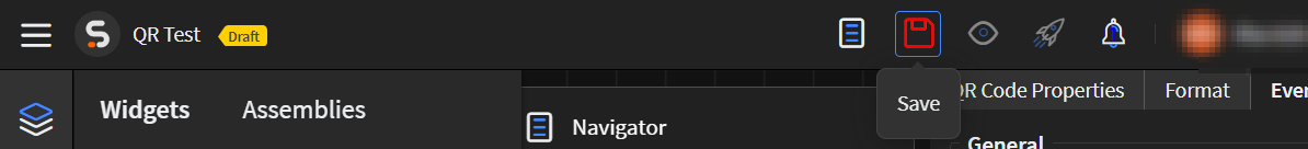
Select Save in the SOTI Snap
banner to apply your changes.
Results
Tip: Select Preview to see how the widget
appears in your app.