Battery Status Dashboard
You can view the Battery Status dashboard by selecting it from the Dashboard dropdown menu.
Top X Battery Capacities
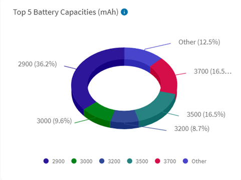
View the breakdown of rated battery capacities (for example, how much charge a brand-new battery has when fully charged), belonging to devices that have reported data to SOTI XSight.
How to use this chartView your device fleet based on rated capacity and filter your devices based on battery capacity
CalculationEach segment shows the percentage of devices by rated battery capacity in mAh based on the Top X rated battery capacities.
ConfigurationsDashboard users can change how many top-rated battery capacities show on the chart. Changes to this dashboard are specific to the user and are not applied globally to all users.
Known LimitationsSome devices report their rated battery capacities incorrectly.
Remaining Battery Capacity
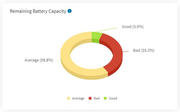
This chart shows the breakdown of the battery health of devices based on maximum charge the device’s battery can hold relative to when it was new.
How to use this chartView device batteries that no longer hold at least 75% of their originally rated charging capacity. Batteries that hold less than 75% capacity are not reliable and most manufacturers recommend replacement.
CalculationAn estimation of a battery’s remaining capacity occurs when:
- The device’s battery level is 90% to 100%.
- The device is charging.
The SOTI XSight Agent estimates the remaining capacity by measuring how much charge (in mAh) a device’s battery accumulates as the battery level changes. It then extrapolates that measurement to estimate how much charge (in mAh) a battery would hold if fully charged. This displays as a percentage of the original rated capacity
The Remaining Battery Capacity categories are:
- Good: Estimated to hold at least 75% of its original rated capacity while the device reports the battery as fully charged.
- Average: Estimated to hold 50% to 74% of its original rated capacity while the device reports that battery as fully charged.
- Bad: Estimated to hold less than 50% of its original rated capacity while the device reports the battery as fully charged.
Some devices report their rated battery capacities incorrectly so categorization of batteries by remaining battery capacity may be wrong for those devices.
Since this dashboard treats batteries as an extension of the device, swapping batteries in and out of devices may result in wrong calculations of the remaining battery capacities.
Battery Temperature
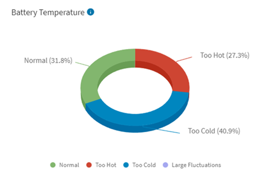
This chart shows a breakdown of the temperature conditions in which devices operate.
How to use this chartFreezing temperatures, hot temperatures or large temperature variations can degrade the life of a battery. This chart displays devices that underwent these conditions and advises device users about the treatment of their devices. For example, do not leave a device in a vehicle on a hot day.
CalculationDevice categorizations according to battery temperature as follows:
- Normal: Temperature never exceeded 35°C (90°F) nor dipped below 0°C (32°F) during the date range specified in the dashboard.
- Too Hot: Temperature went above 35°C (90°F) at least once, but never dipped below 0°C (32°F) during the date range specified in the dashboard.
- Too Cold: Temperature never exceeded 35°C (90°F), but dipped below 0°C (32°F) at least once during the date range specified in the dashboard.
- Large Fluctuations: Temperature went above 35°C (90°F) at least once and dipped below 0°C (32°F) at least once during the date range specified in the dashboard.
Average Daily Charge Cycles
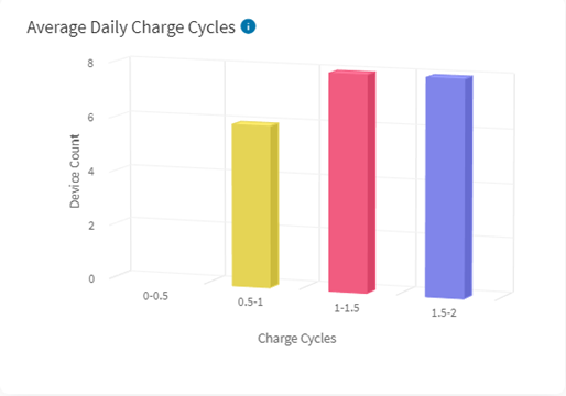
This chart shows a breakdown of the average daily charge cycles during the date range specified. The completion of a charge cycle occurs when the combined levels of charging and discharging reach 100%. For example, if you discharge your fully charged battery 20% and charge it back to full and repeat it 5 times, this would count as one battery cycle.
How to use this chartView batteries that underwent several charge cycles over a short duration of time. This may indicate that devices/apps are rapidly draining the batteries, intense device usage or the batteries may be nearing the end of their life cycle.
CalculationSum of all charge cycles (as defined above) that a device’s battery goes through during the date range specified in the dashboard.
There are 4 groups of devices, depending on the number of charge cycles they have completed:
- 0 to 4 charge cycles.
- 5 to 9 charge cycles.
- 10 to14 charge cycles.
- 15 or more charge cycles.
Total Charge Cycles
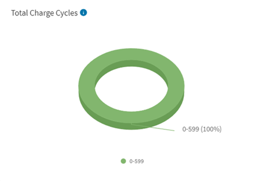
This chart shows a breakdown of device batteries by the number of charge cycle increases since enrollment until the selected end date. A battery completes one charge cycle when charged and discharged an amount equal to 100% of its full capacity five times.
How to use this chartIdentify batteries that may be nearing the end of their useful life. Batteries are typically rated for a certain number of charge cycles. Once past that threshold, they are no longer considered reliable.
CalculationThe sum of charge cycles that a device goes through since its enrollment to the end of the date range specified in the dashboard.
There are 4 groups, depending on the number of charges cycles the device have undergone:
- 0 to 149 charge cycles.
- 150 to 497 charge cycles.
- 498 to 1000 charge cycles.
- 1000 or more charge cycles.
Charging Pattern
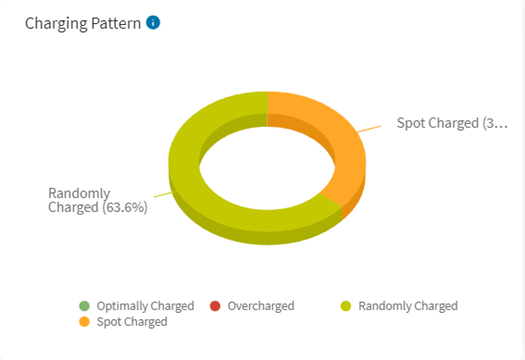
This chart shows a breakdown of predominant charging patterns of devices during the date range specified in the dashboard. Charge patterns consist of one or more charging sessions. There are four charging pattern groups:
- Optimal: Device charged to 80%-100% and then unplugged.
- Overcharged: Device charged to full and then left plugged in.
- Spot: The device was not charged to 80% and then plugged in and unplugged several times during the day for short periods.
- Random: The device was not charged to 80% and then plugged in and unplugged only once during the day.
Overcharging can contribute to degradation of batteries. Use this chart to identify device batteries that have the predominant charging patterns of Optimal or Overcharged. To extend their battery life, instruct users on how to optimally charge their devices to extend battery life.
Every hour, the chart identifies charging sessions as Optimal, Overcharged, Spot, or Random based on the charge pattern classifications. On a given day, if a device does not go through any charging session, it reports as No Data. In the case of ties, the designation of Random takes precedence over Spot, which takes precedence over Optimal, which takes precedence over Overcharged, which takes precedence over No Data.
Charging Type
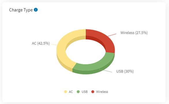
This chart shows a breakdown of predominant charging types for devices during the date range specified in the dashboard. Charge types consist of one or more charging sessions. The charging type classifications are:
- AC: A charging session using an AC charger.
- USB: A charging session using a PC or another device for charging.
- Wireless: A charging session using a wireless charger.
Charging a device in a certain way can impact the life of its battery. Wireless charging, for example, can heat up the battery and can degrade a battery’s long-term performance. In general, it is better to avoid wireless charging when possible.
CalculationEvery hour, the chart identifies charging sessions for devices as AC, Dock, USB or Wireless, using the charge type definitions above. On a given day, if a device does not go through any charging session, it reports as No Data. There are five groups (AC, Dock, USB, Wireless or No Data) depending on the most frequent charge type seen during the date range specified in the dashboard. In the case of ties, the designation of Wireless takes precedence over AC, which takes precedence over USB, which takes precedence over No Data.
Charge Level at X
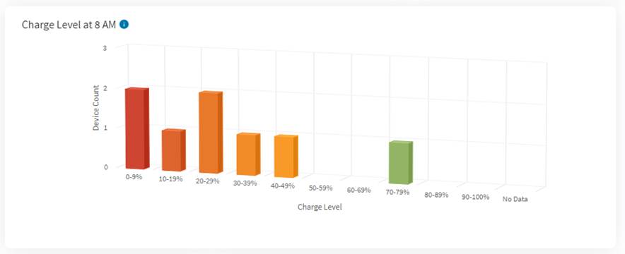
This chart shows a breakdown of the charge levels of devices at a specific hour of the day.
How to use this chartView which devices are not fully charged at the start of a workday, and may not likely last an entire shift.
CalculationThis chart uses charge level data from the last day of the date range, and groups devices in increments of 10% based on their charge level at the specified time. The chart adds the device to the No Data group if no data was available for a device at the specified time.
ConfigurationsDashboard users can change which time to use for this chart (from 12 AM to 11 PM). Changes to this dashboard are specific to the user and are not applied globally for all users.
Discharge Rate
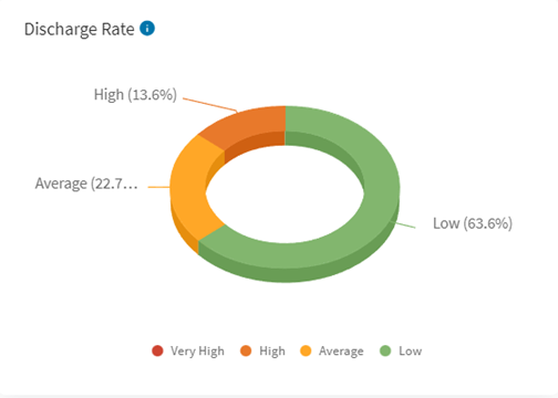
This chart shows a breakdown of the average battery discharge rate that devices underwent during the date range specified in the dashboard. Discharge rate classifications are:
- Low: Average discharge rate over the selected period is < 6%/h.
- Average: Average discharge rate over the selected period is ≥ 6%/h or < 9%/h.
- High: Average discharge rate over the selected period is ≥ 9%/h or < 12%/h.
- Very High: Average discharge rate over the selected period is ≥ 12%/h.
View devices that are discharging at a high rate, which may indicate app issues or that the batteries may be nearing the end of their useful life.
CalculationThe chart calculates the discharge rate as the total change in battery level during discharge divided by the total time of discharge (in seconds) over the specified date range. This value is then converted into an hourly discharge rate and grouped into incremental average discharge rates of 5%. The chart groups devices that did not report any discharges during the date range as No Data.
Top X App Drain (Foreground)
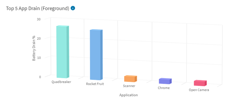
This chart shows the breakdown of apps that have drained device batteries the most.
How to use this chartDiscover potential app issues by identifying the apps that have contributed the most to battery drain.
CalculationWhen an application is in the foreground, it accumulates battery drain attribution. Battery drain is the sum of all battery level drops while the app was in the foreground divided by the total battery level drops during the specified date range.
Only the Top X apps with the largest percentage battery drain display.
ConfigurationsDashboard users can change how many top draining apps to show on the chart. Changes to this chart configurations are specific to the user and are not applied globally to all users.