Joe Medeiros, Creative Director at SOTI, has been with the company for over 12 years. He designed the initial SOTI ONE Platform brand and logo, which included the creative direction of its associated SOTI products, and also headed the recent redesign. Here, he shares insights into the process that resulted in these new and exciting logos.
As the market changes, SOTI adapts along with it. SOTI is focused on driving performance, and we wanted that same message to be represented in our product brands and logos. You will now see a fresh new look and feel that is all about performance.
These design changes started with the launch of SOTI XSight in 2021. It inspired us to look at our brand from both an aesthetic and progressive perspective. Visually, the SOTI XSight logo didn’t look like the other SOTI ONE Platform product logos. It was a classic case of “one of these things is not like the other:”
Secondly, the SOTI ONE Platform itself is all about smooth and seamless integration. It’s an innovative suite of solutions that work best when they interact with each other. It’s designed to let organizations know they can manage mobile devices and business-critical printers, digitize manual processes, troubleshoot issues and collect device performance data, and access a network of experts in a few clicks from a secure login. It’s meant to be fluid, and we wanted all our logos to reflect that in the best possible way.
Updating the SOTI ONE Platform Logo
Before the actual design work started, we decided what we wanted to accomplish:
- Create a family of logos: All logos needed to have the same look and feel. When anyone sees any of the logos, they should immediately be able to identify it as part of the SOTI ONE Platform.
- Embrace harmony: As mentioned earlier, the strength of the SOTI ONE Platform is the interconnectivity of its products. We wanted to highlight that one product links with another to create this simple, powerful and easy-to-use solution.
- Use strong colors: The SOTI ONE Platform is full of colorful, bright, attention-grabbing charts that are easy to understand. We wanted to bring that same dynamic to the individual product logos and the logo of the SOTI ONE Platform itself.
Because we used the SOTI XSight logo as our inspiration for the remaining individual product logos, we started with the logo and wordmark for the SOTI ONE Platform, and approached this with fresh eyes.


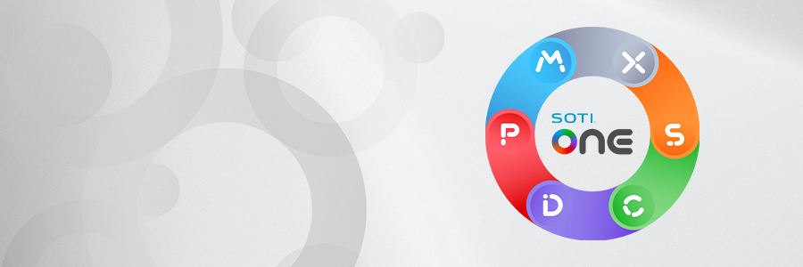
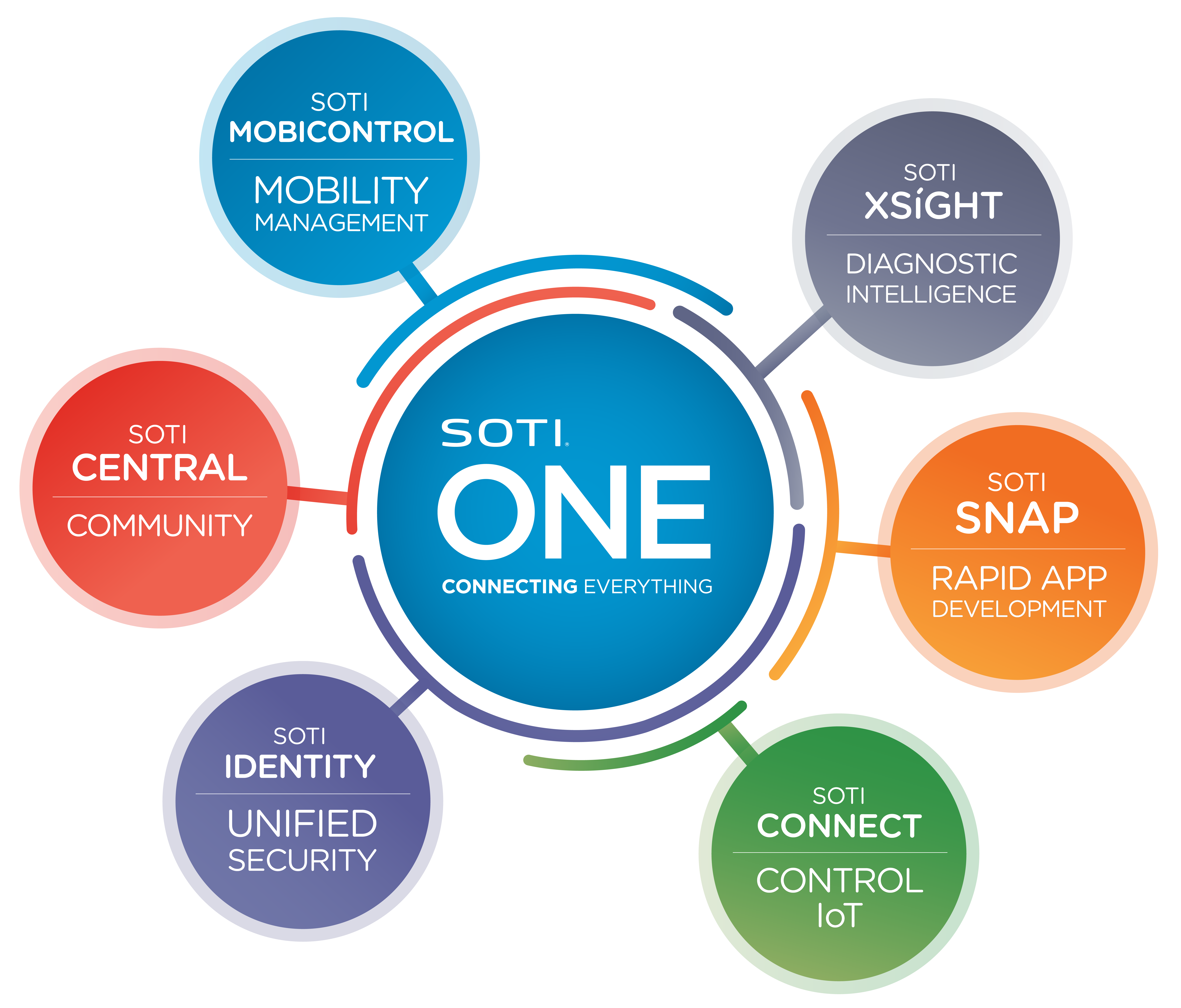
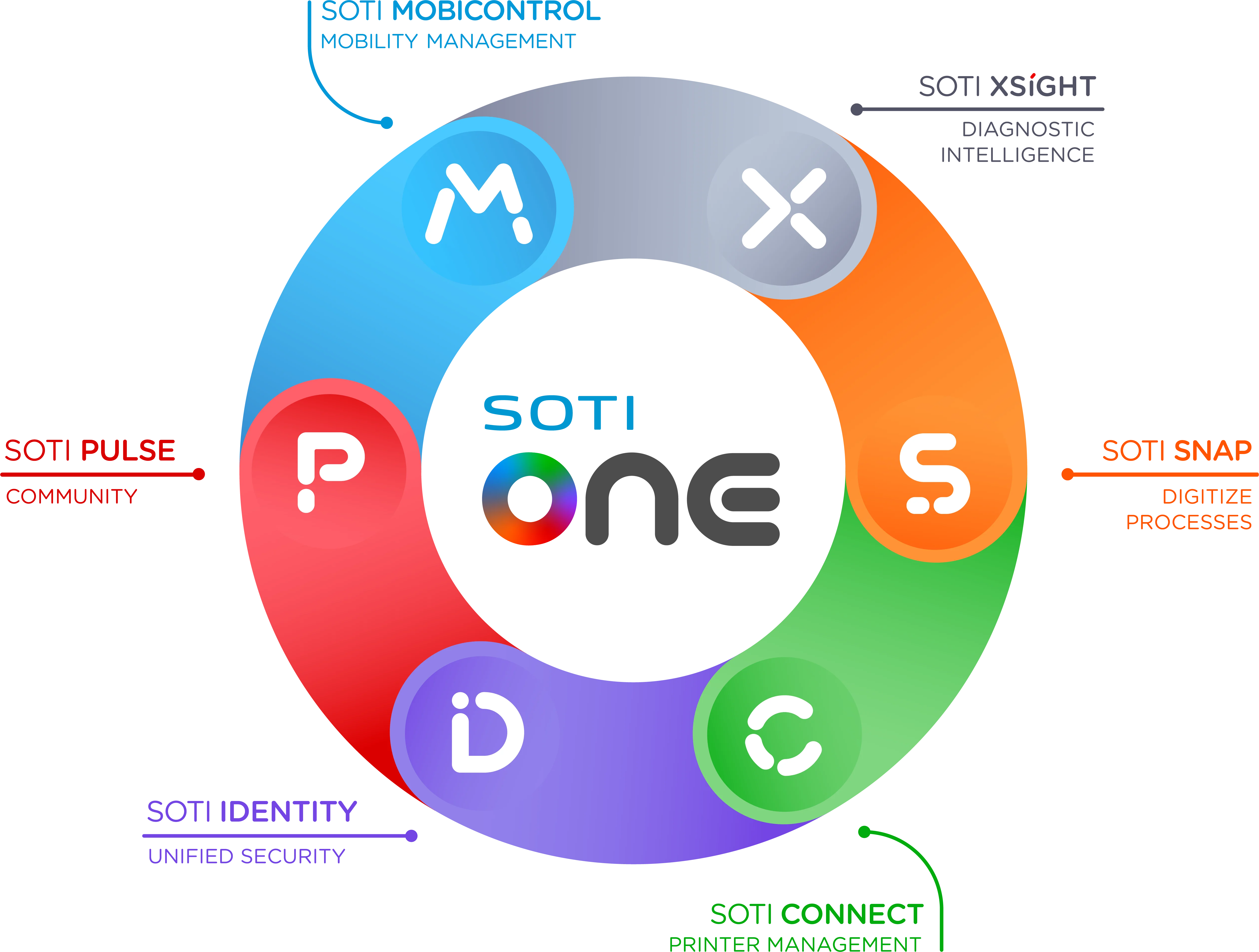
The SOTI ONE Platform logo and wordmark are meant to encompass all its individual products: SOTI MobiControl, SOTI XSight, SOTI Snap, SOTI Connect, SOTI Identity and SOTI Pulse. The colors and product logos communicate that the SOTI ONE Platform is at its best when all its products are working together. For the wordmark, sleek curves are representative of what technology should be - good looking and easy to use with no obstacles in the way.
Updating the SOTI Product Icons
For the individual SOTI product icons, we wanted to follow the path established by the SOTI XSight logo. Shaped like the letter ‘X’, it’s easy to associate the logo with the name of the product and vice-versa. Our products have strong features and capabilities, which means their names are also powerful. We wanted every logo to be instantly recognizable and memorable. When you see any or all these logos, you know you are getting a world-class solution from a world-class organization.
Another challenge in updating the SOTI ONE Platform product icons was that SOTI Central was given a new name, SOTI Pulse. SOTI Pulse is where SOTI customers, partners and experts go to connect, collaborate and communicate. The name was changed to reflect that it’s a go-to place where visitors can be up to date on trends, information and insights regarding mobile technology and the industry. We wanted to ensure the new logo was indicative of SOTI Pulse being a thriving, vibrant community.
Pride in the Process
Changing logos as iconic as SOTI’s is not an overnight process. It involved many meetings with key stakeholders, numerous graphical iterations and some deep discussions on how we wanted to present SOTI to the world.
The process to update these logos is representative of working at SOTI; collaboration between teams, positive input and encouragement from senior leadership and trusting our designers to bring different, out-of-the-box ideas to the table.
Once the “winning” design was selected, it was refined. That meant tweaking colors so they would look perfect on digital assets like our website and physical assets like brochures and signage. It also meant playing with positioning and sizing to ensure they fit perfectly within the user interface (UI) of our products.
A Few Final Thoughts
Our customers and partners played a huge role in this refresh. They came to us with ideas and feedback on how we can take the SOTI ONE Platform to the next level. Their input played a major role in how our products adapt and evolve to meet their needs. Their inspiration leads to innovation, and these new logos and icons reflect that clearly.
Thank you for taking the time to read this blog and learn about the process behind our exciting redesign. It was my pleasure to share this story.


