Wi-Fi
The Wi-Fi dashboard displays information such as Wi-Fi signal strength, network usage by device, access point usage, and device disconnects. See the Device Analysis Dashboards Overview section for information on Accessing and Customizing a Device Analysis Dashboard.
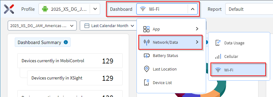
To open the Wi-Fi dashboard:
- Follow steps 1 through 4 in Accessing and Customizing a Device Analysis Dashboard.
- In the Dashboard dropdown, select .
-
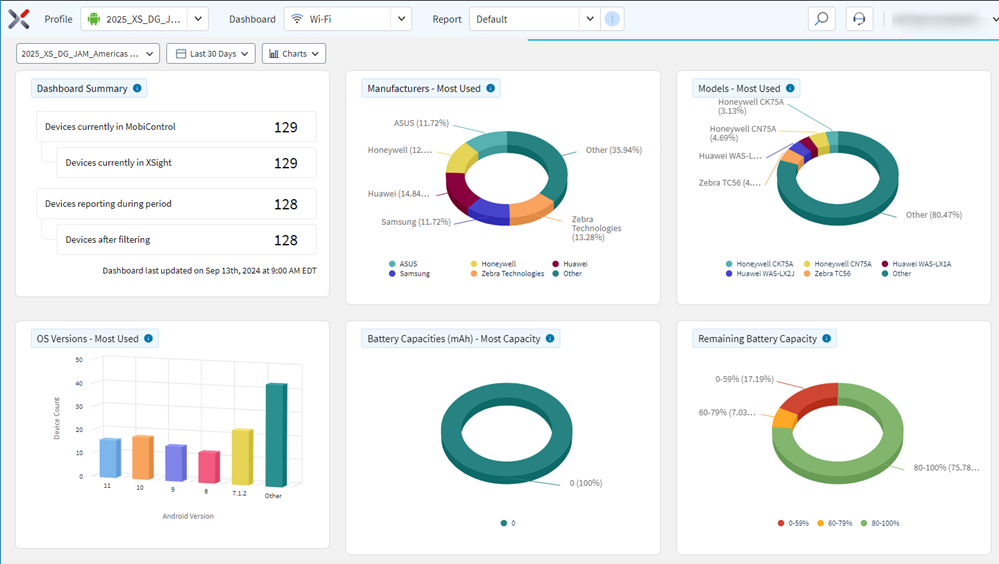
Hover over data in a chart to see more detail. Select data in a chart to filter the other charts.
- The bottom of the dashboard lists all devices in the selected analysis profile.
- Selecting a segment or column in a chart refines the list.
- Selecting any of the devices in the list opens the Device Spotlight view.
- The view shows operational details of the selected device.
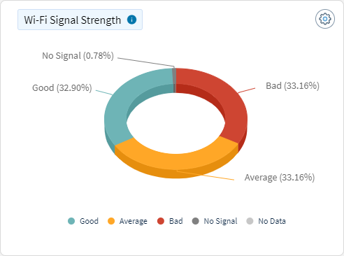
Wi-Fi Signal Strength
This chart categorizes Wi-Fi signal strength readings into different user-defined buckets, such as "Bad," "Average," and "Good." The chart segments the signal strength reading data, providing a visual representation of the proportion of readings that fall into each category.
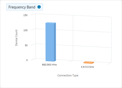
Frequency Band
This chart maps Wi-Fi signal readings to different frequency bands (for example, 2.4 GHz, 5 GHz).
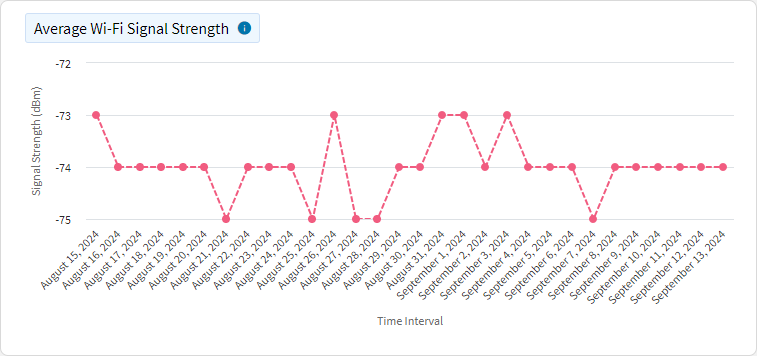
Average Wi-Fi Signal Strength
This chart displays the average Wi-Fi signal strength over time, measured in dBm. The x-axis represents time (for example, days, hours), and the y-axis shows the average signal strength.
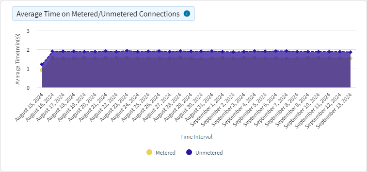
Average Time on Metered/Unmetered Connections
This chart shows the average time devices spend per day on metered and unmetered connections. The x-axis represents time (for example, days), and the y-axis shows the average time spent on each type of connection, ignoring null values but including 0 and capping at 24 hours.
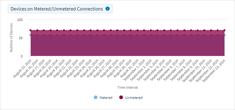
Devices on Metered/Unmetered Connections
This chart shows the number of devices connected to metered or unmetered connections over time. The x-axis represents time (for example, days, hours) and the y-axis represents the number of devices.
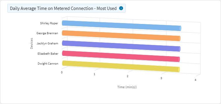
Daily Average Time on Metered Connection
This chart shows which devices spend the most or least time on metered connections per day, ignoring null values, including 0 and capping at 24 hours in the average calculation. The y-axis represents individual devices, while the x-axis shows the average time spent on metered connections.
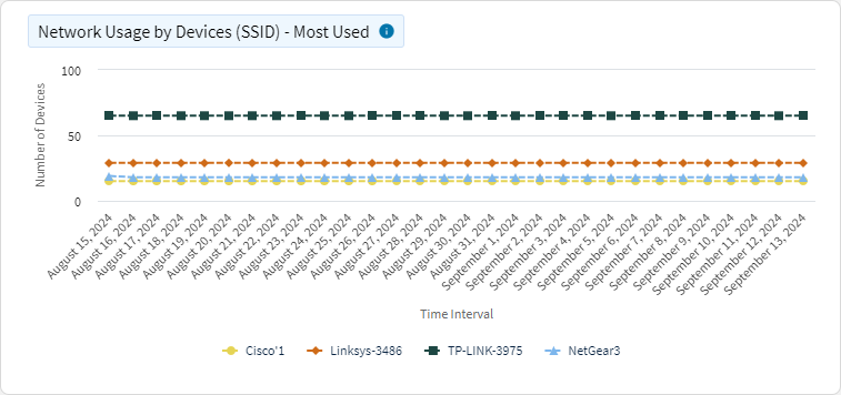
Network Usage by Devices (SSID)
This chart shows the most or least Wi-Fi networks (SSIDs) used by the number of devices over time. The x-axis represents time (for example, days, hours), while the y-axis shows the number of devices connected to each SSID.
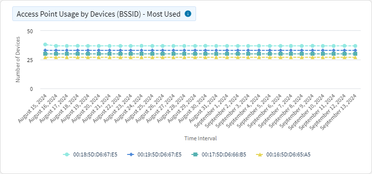
Access Point Usage by Devices (BSSID)
This chart shows the most or least Wi-Fi access points (BSSIDs) used by the number of devices over time. The x-axis represents time (for example, days, hours), and the y-axis shows the number of devices connected to each access point.
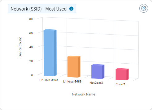
Network (SSID)
This chart shows the most or least used Wi-Fi networks (SSIDs) by the number of devices. The x-axis represents different networks, while the y-axis shows the number of devices connected to each network.
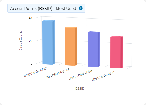
Access Points (BSSID)
This chart shows the most or least used Wi-Fi access points (BSSIDs) by the number of devices. The x-axis represents different access points, while the y-axis shows the number of devices connected to each access point.
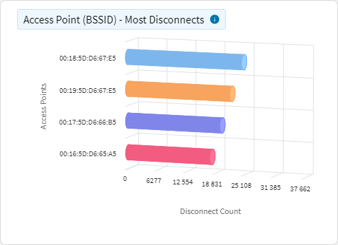
Access Point–Disconnects
This chart shows the Wi-Fi access points (BSSIDs) with the most or least number of device disconnections. The x-axis represents different access points, while the y-axis shows the number of disconnections.
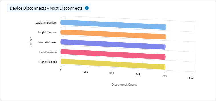
Device Disconnects
This chart shows the devices with the most or least number of disconnects from a Wi-Fi network. The y-axis represents individual devices, while the x-axis shows the number of disconnections.
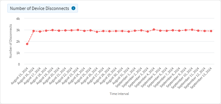
Number of Device Disconnects
This chart shows the number of device disconnects from the Wi-Fi network over time. The x-axis represents time (for example, days, hours) and the y-axis represents the number of disconnects.
