Cellular
The Cellular dashboard shows device signal strength per network carrier and type. See the Device Analysis Dashboards Overview section for information on Accessing and Customizing a Device Analysis Dashboard.
To open the Cellular dashboard:
- Follow steps 1 through 4 in Accessing and Customizing a Device Analysis Dashboard.
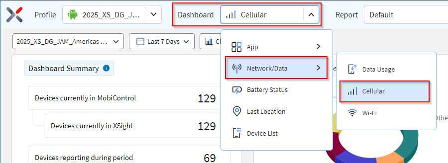
- In the Dashboard dropdown, select .
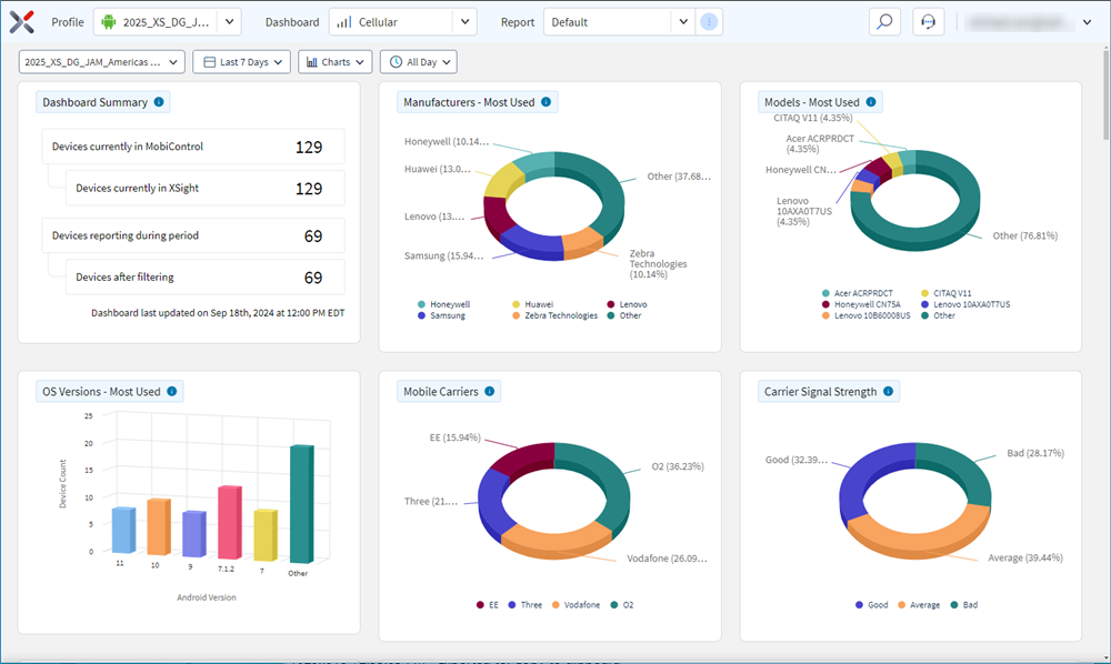
- Hover over data in a chart to see more detail. Select data in a chart to filter
the other charts. Selecting a segment or column in a chart refines the
list.
-
Note: The device list appears at the bottom of the dashboard.
- The device list lists all devices in the selected analysis profile.
- Selecting any of the devices in the list opens the Device Spotlight view.
- The Device Spotlight view shows operational details of the selected device.

Network Type
This chart shows devices categorized by connection type. Select a segment to analyze devices with a common connection type.
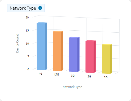
Use this chart to identify signal strength based on whether the device connected via 5G, 4G, 3G, LTE or an unknown connection.
CalculationSOTI XSight identifies signal strength of device based on the medium the device connects to.
ConfigurationsDashboard users can change the data collection time. By default, the displayed data shows data collected at 8:00 AM. The user can change this time and view the data at different times of the day through the dropdown menu of the header.
Mobile Carriers
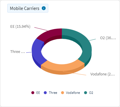
This chart shows devices categorized by carrier. Select a segment to analyze devices with a common carrier.
How to use this chartUse this chart to identify signal strength of devices based on the mobile carrier of the device.
CalculationSOTI XSight identifies signal strength of devices based on the connected mobile carriers.
ConfigurationsDashboard users can change the data collection time. By default, the displayed data shows data collected at 8:00 AM. The user can change this time and view the data at different times of the day through the dropdown menu of the header.
Carrier Signal Strength
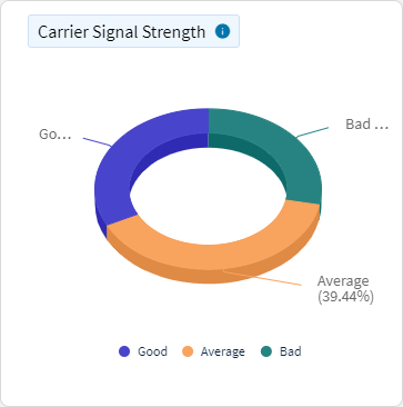
This chart shows devices categorized by carrier signal strength. Select a segment to analyze devices with a common signal strength.
How to use this chartUse this chart to identify signal strength of devices based on the mobile carrier of the device.
CalculationSOTI XSight identifies signal strength of devices based on the carrier signal strength of the devices.
ConfigurationsDashboard users can change the data collection time. By default, the displayed data shows data collected at 8:00 AM. The user can change this time and view the data at different times of the day through the dropdown menu of the header.
Usage by Network Type
This chart categorizes the devices in your fleet by the type of cellular connection they used over a specific time period. The x-axis represents the timeline, while the y-axis shows the number of devices connected via each type of cellular network (for example, 3G, 4G, 5G). Different colors or patterns distinguish the various cellular connection types, making it easy to visualize the distribution and changes in network usage over time.
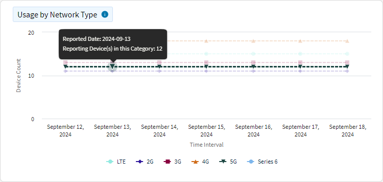
This chart is useful for trend analysis, allowing you to observe shifts in cellular connection types among your devices. For example, you can track the adoption rate of newer technologies like 5G over time. It also aids in network performance monitoring, providing insights into how your fleet's connectivity evolves, which can inform decisions about network investments or upgrades. This can be helpful for resource planning, helping you anticipate future needs based on the connectivity trends observed.
Map Layer Categorizes the devices in your fleet by the types of cellular connections used. Different colors distinguish the various cellular connection types, making it easy to visualize the network distribution.
Total Signal Dropout Duration
This chart tracks the total duration of cellular signal dropouts experienced by devices over a specified time. The x-axis represents the timeline, while the y-axis represents the total duration of signal dropout time.
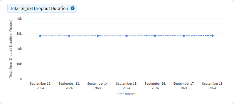
By visualizing this data, the chart allows for trend analysis, making it easy to identify patterns in signal dropout duration, such as whether dropouts are increasing or decreasing over time. This is crucial for performance monitoring as it helps monitor the stability of the network, providing insights into areas where signal dropouts are frequent or prolonged. Consequently, it supports proactive maintenance, enabling the prediction of potential network issues and the planning of maintenance or upgrades to improve network reliability.
Map Layer Visualize signal dropouts experienced by devices and their duration. Mapping that to a location enables you to understand areas with weak signal in need of improvement.
Average Signal Strength
This chart shows the average cellular signal strength experienced by devices over time, with the x-axis representing time intervals and the y-axis representing average signal strength, measured in dBm (decibels relative to a milliwatt) for RSRP for 5G and 4G, RSCP and RSSI for 3G, and RSSI for 2G.
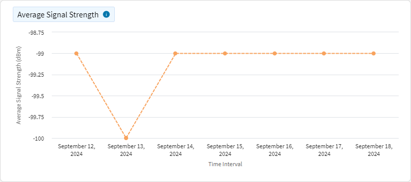
The chart serves as a tool for signal health monitoring, allowing you to observe the general health of the cellular network by tracking signal strength fluctuations over time. It also facilitates optimization, helping to identify periods or locations with weak signal strength, providing opportunities for network improvements. Additionally, it aids in resource allocation, assisting in the planning and deployment of resources in areas with insufficient signal strength.
Map Layer Visualize signal strength measured by devices and their location. Mapping the reading to a location enables you to understand areas with weak signal in need of improvement. Measured in dBm (decibels relative to a milliwatt) for RSRP for 5G and 4G, RSCP and RSSI for 3G, and RSSI for 2G.
| Network Type | Limitations |
|---|---|
| 2G |
Signal Quality–Not available Bit Error Rate–No API limitations RF channel number–No API limitations |
| 3G | Signal Quality–Not available Ec/No–Android 11 or above RF channel number–No API limitations |
| 4G |
RSRQ–Android 8 or above RSSNR–Android 8 or above Bands–Android 11 or above |
| 5G |
RSRQ–Android 10 or above SINR–Android 10 or above Bands–Android 11 or above |
Average Signal Quality
This chart displays the average quality of cellular signals experienced by devices over time, with the x-axis representing time intervals and the y-axis representing average signal quality, measured in dB for RSRQ for 5G and 4G, ECNO for 3G, and RXQUAL for 2G.
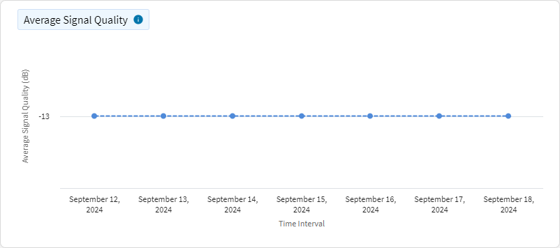
The chart provides insights for quality assurance, allowing you to monitor the overall quality of the cellular network, which directly impacts user experience. It is also effective for issue detection, helping identify periods of poor signal quality that might correlate with service disruptions or user complaints. Moreover, it aids in decision support, assisting in making informed decisions regarding network upgrades or troubleshooting.
Map Layer Visualize signal quality measured by devices and their location. Mapping the reading to a location enables you to understand areas with weak signal in need of improvement. Measured in dB for RSRQ for 5G and 4G, ECNO for 3G, and RXQUAL for 2G.
Average Signal-to-Noise Ratio
This chart illustrates the average signal-to-interference-plus-noise ratio (SINR) experienced by devices over time, with the x-axis representing time intervals and the y-axis indicating the average SINR, measured in decibels (dB) for 5G and 4G.
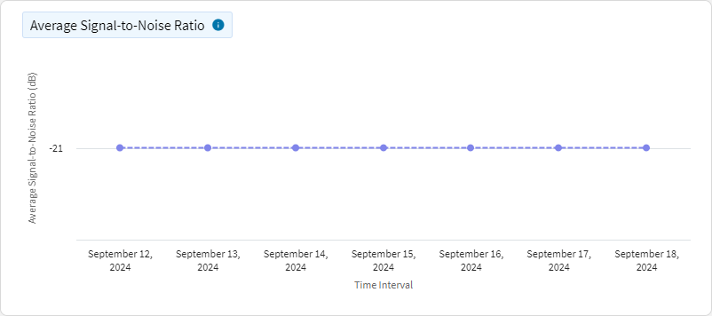
The chart helps assess the clarity of the network by showing how much of the signal is affected by noise. It also supports interference management, identifying times or locations where noise degrades signal quality, enabling targeted efforts to reduce interference. It also provides essential data for performance optimization, particularly in noisy environments.
Map Layer Visualize signal-to-noise ration measured by devices and their location. Mapping the reading to a location enables you to understand areas with weak signal in need of improvement. Measured in decibels (dB) for 5G and 4G.
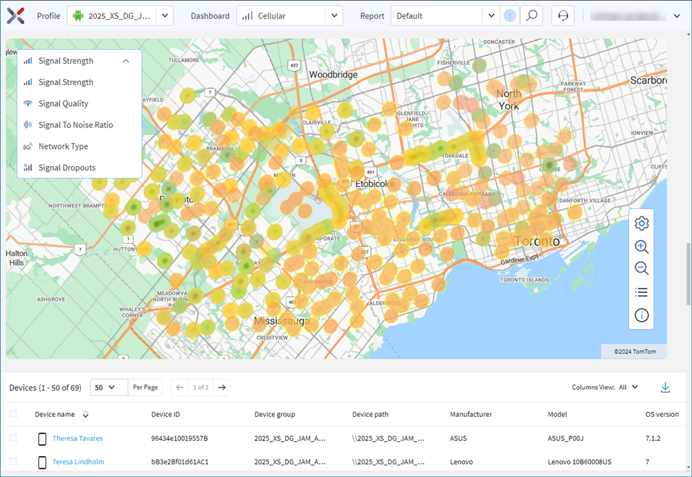
Map
This map helps you visualize various aspects of the network and signal strength.
