Data Usage
The Data Usage dashboard displays information about the type and amount of data used by selected devices and total data usage for a selected period. See the Device Analysis Dashboards Overview section for information on Accessing and Customizing a Device Analysis Dashboard.
To open the Data Usage dashboard:
- Follow steps 1 through 4 in Accessing and Customizing a Device Analysis Dashboard.
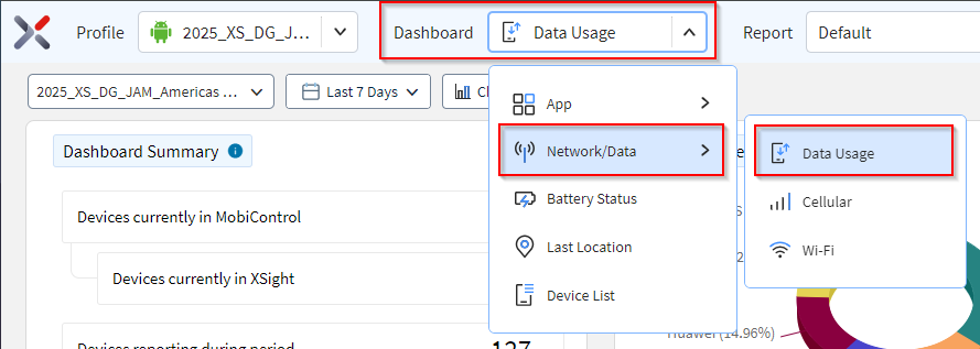
- In the Dashboard dropdown, select .
-
Hover over data in a chart to see more detail. Select data in a chart to filter the other charts. Selecting a segment or column in a chart refines the list.
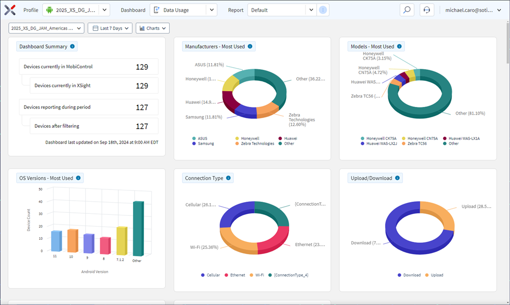 Note: The device list appears at the bottom of the dashboard.
- The device list lists all devices in the selected analysis profile.
- Selecting any of the devices in the list opens the Device Spotlight view.
- The Device Spotlight view shows operational details of the selected device.
Connection Type
This chart shows data consumed by Cellular/Ethernet/Wi-Fi. Select a segment to analyze data usage with a common connection type.
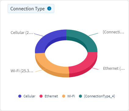
Use this chart to identify data Usage of devices based on whether the device connects via Cellular, Ethernet or Wi-Fi.
CalculationSOTI XSight identifies the amount of data transferred by devices on different connection types.
Upload/Download
This chart shows data usage categorized by nature of data transaction. Select a segments to analyze uploaded or downloaded data.
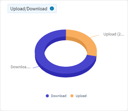
View data usage of devices based on data uploaded/downloaded.
CalculationSOTI XSight identifies data usage based on the nature of data transaction.
Top Apps Data Usage
This chart shows which apps used the most data. Select a segment to analyze data usage for each application.
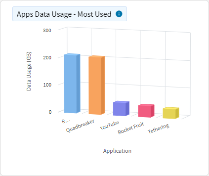
Use this chart to identify apps that use the most data in the specified time interval.
CalculationSOTI XSight identifies which apps use the most data.
ConfigurationsDashboard users can change how many top Android apps to display. Changes to this dashboard are specific to the user and are not applied globally for all users.
Top Browsers Data Usage
This chart shows which browsers used the most data. Select a segment to analyze data usage for each browser.
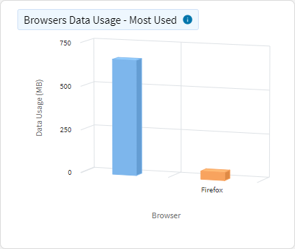
View the browser apps that use the most data in the specified time interval.
CalculationSOTI XSight identifies which browser apps use the most data.
ConfigurationsDashboard users can change how many top Android apps to display. Changes to this dashboard are specific to the user and are not applied globally for all users.
Total Data Usage
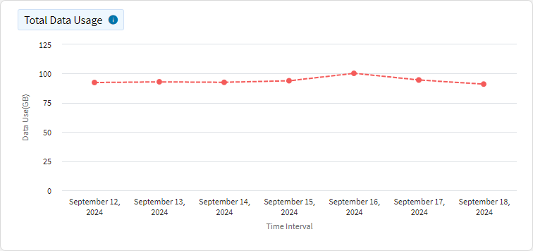
This chart shows the total data usage across all the devices during the selected time period.
Roaming Data Usage
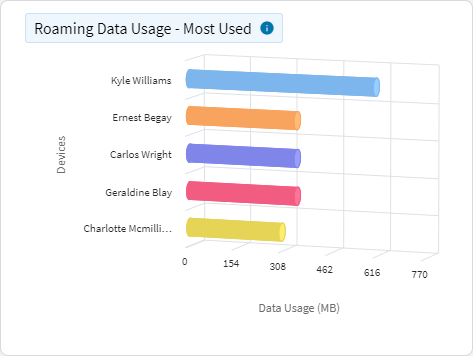
This chart shows a list of devices sorted by their roaming data usage, either displaying those with the most or least data consumed while roaming. The y-axis represents individual devices, while the x-axis shows the amount of roaming data used.
Total Roaming Data Usage
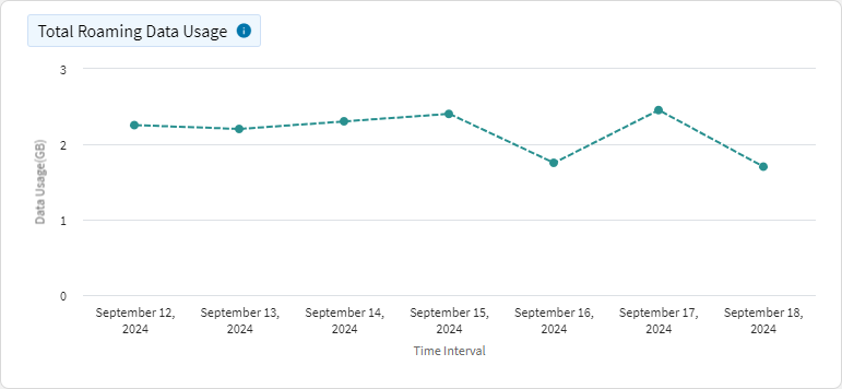
This chart tracks the total roaming data usage for your devices over time. The x-axis represents time (for example, days, hours), and the y-axis shows the total data consumed while roaming.
Tether Data Usage
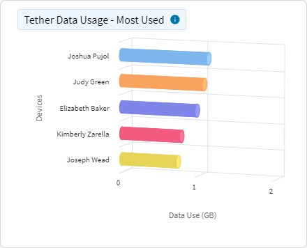
This chart shows a list of devices sorted by their tether and hotspot data usage, either displaying those with the most or least data consumed. The y-axis represents individual devices, while the x-axis shows the amount of tether and hotspot data used.
Average Time on Connection Type
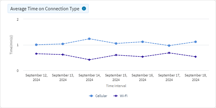
This chart shows the average time devices spend per day using a specific network type (for example, Cellular or Wi-Fi). The x-axis represents time (for example, days), and the y-axis shows the average time spent on each type of connection, ignoring null values but including 0 and capping at 24 hours.
Connection Usage Time
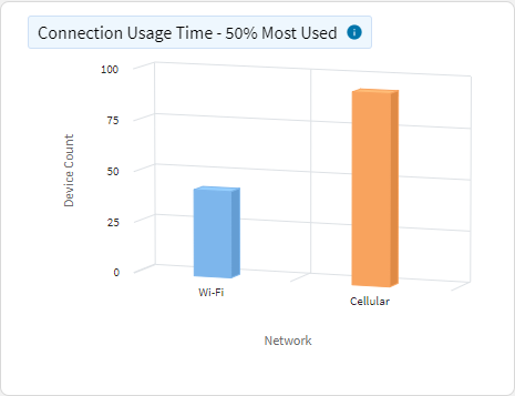
This chart shows the number of devices that spend at least a selected percentage of time on a specific connection type, such as Wi-Fi or Cellular. You can customize the chart to display devices that spent the most or least amount of time on connection.
Roaming Use Time
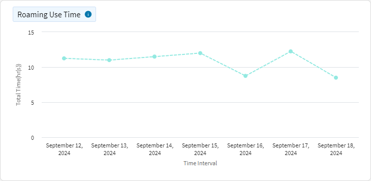
This chart shows the time devices spend on roaming connections over time. The x-axis represents time (for example, days, hours), while the y-axis shows the total time spent on roaming.
VPN Use Time
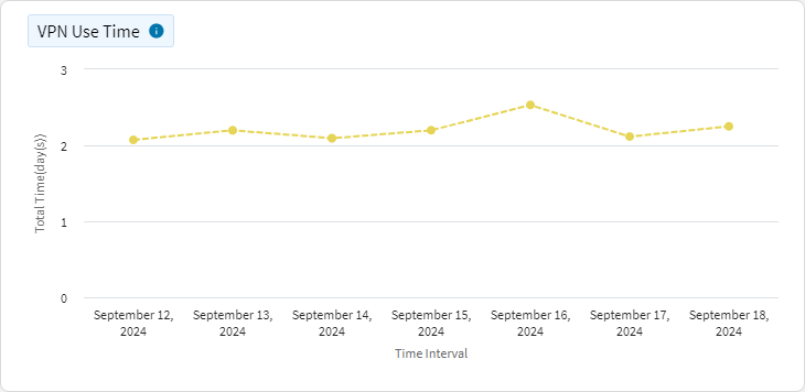
This chart shows the time devices spend on a VPN connection over time. The x-axis represents time (for example, days, hours), while the y-axis shows the total time spent on VPN connections.
