Wi-Fi
The Wi-Fi spotlight provides a view of Wi-Fi characteristics on the device such as signal strength, app data usage, time on network and access point disconnects.
To navigate to the Wi-Fi spotlight page.
- Follow steps 1–5 in Device Spotlights Overview.
- In the Device Spotlight screen, select the
Wi-Fi icon.

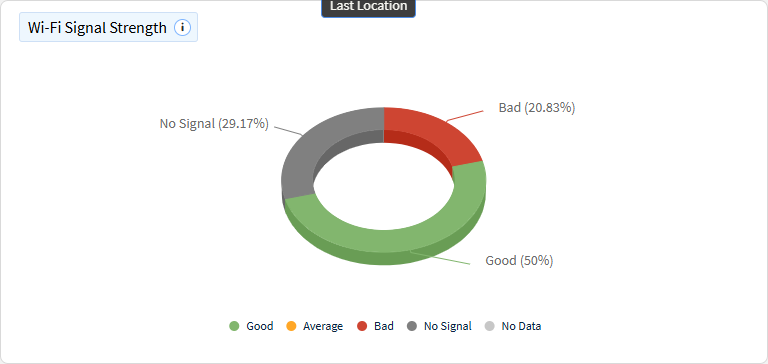
Wi-Fi Signal Strength
This chart categorizes Wi-Fi signal strength readings into different user-defined buckets, such as "Bad," "Average," and "Good." The chart segments the signal strength reading data, providing a visual representation of the proportion of readings that fall into each category.
Frequency Band
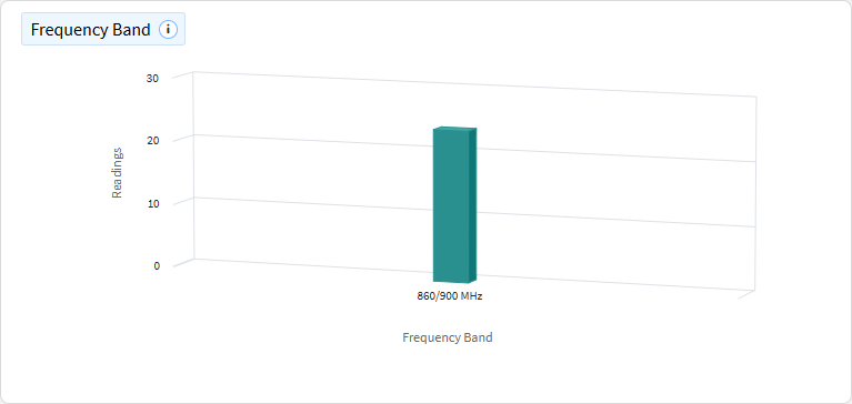
This chart maps Wi-Fi signal readings to different frequency bands (e.g., 2.4 GHz, 5 GHz).
Daily Average Wi-Fi Signal Strength
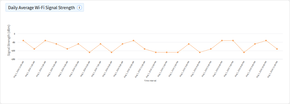
This chart displays the average Wi-Fi signal strength over time, measured in dBm. The x-axis represents time (e.g., days, hours), and the y-axis shows the average signal strength.
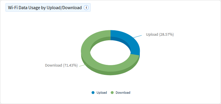
Wi-Fi Data Usage by Upload/Download
This chart shows Wi-Fi data usage broken down by upload and download. The chart segments total data usage into two categories, providing a visual of how data consumption is divided between uploading and downloading.
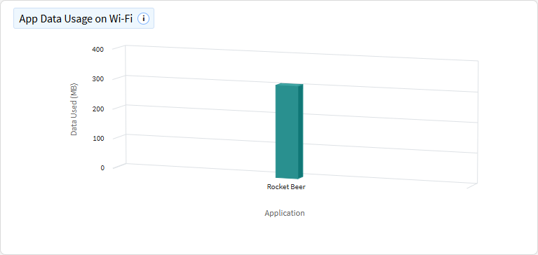
App Data Usage on Wi-Fi
This chart visualizes which applications used the most data over Wi-Fi. Each segment represents a different application, with the size of the segment corresponding to the amount of data consumed.
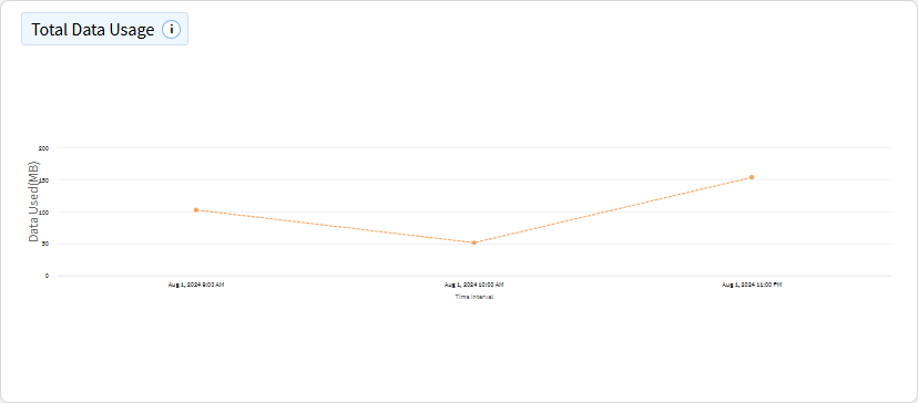
Total Data Usage
This chart tracks Wi-Fi data usage over time, broken down by day and hour. The x-axis represents the timeline, while the y-axis shows the amount of data used.
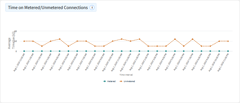
Time on Metered/Unmetered Connections
This chart shows the average time devices spend per day on metered and unmetered connections. The x-axis represents time (e.g., days), and the y-axis shows the average time spent on each type of connection. Ignoring null values but including 0 and capping at 24 hours.
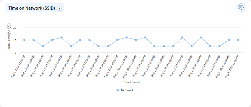
Time on Network (SSID)
This chart shows the most or least used Wi-Fi networks (SSIDs) by the number of devices over time. The x-axis represents time (e.g., days, hours), while the y-axis shows the number of devices connected to each SSID.
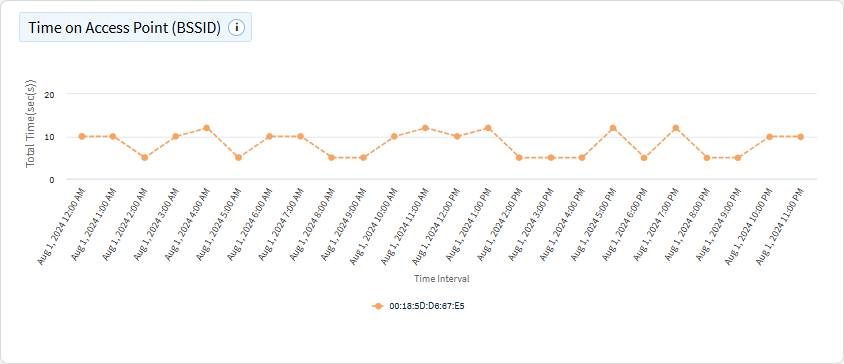
Time on Access Point (BSSID)
This chart shows the most or least used Wi-Fi access points (BSSIDs) by the number of devices over time. The x-axis represents time (e.g., days, hours), and the y-axis shows the number of devices connected to each access point.
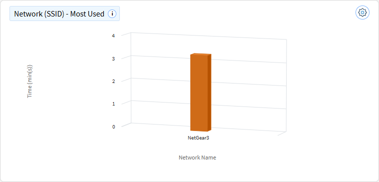
Network (SSID) - Most Used
This chart shows the most or least used Wi-Fi networks (SSIDs) by the number of devices over time. The x-axis represents time (e.g., days, hours), while the y-axis shows the number of devices connected to each SSID.
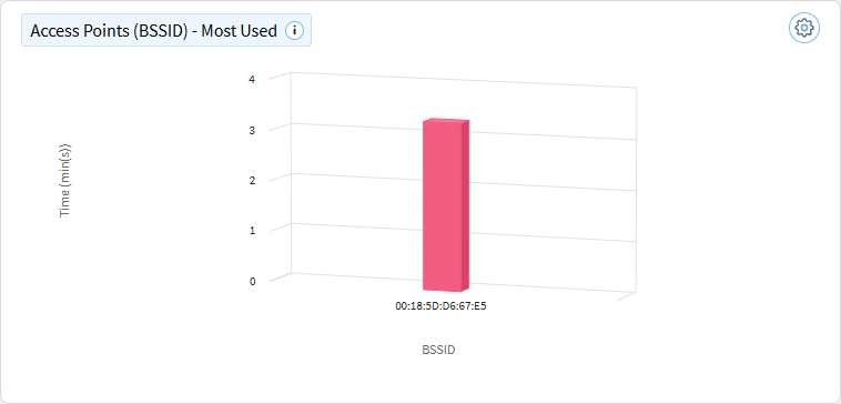
Access Points (BSSID) - Most Used
This chart shows the most or least used Wi-Fi access points (BSSIDs) by the number of devices. The x-axis represents different access points, while the y-axis shows the number of devices connected to each access point.
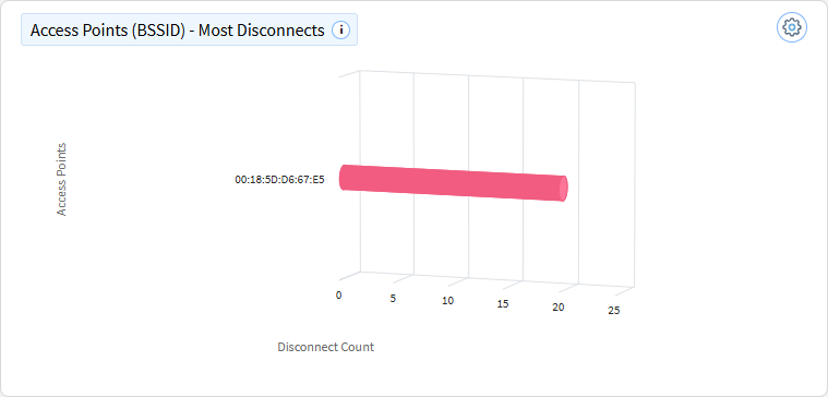
Access Points (BSSID)- Most Disconnects
This chart shows the Wi-Fi access points (BSSIDs) with the most or least number of device disconnections. The x-axis represents different access points, while the y-axis shows the number of disconnections.
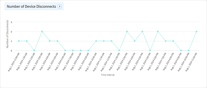
Number of Device Disconnects
This chart shows the number of device disconnects from the Wi-Fi network over time. The x-axis represents time (e.g., days, hours) and the y-axis represents the number of disconnects.
