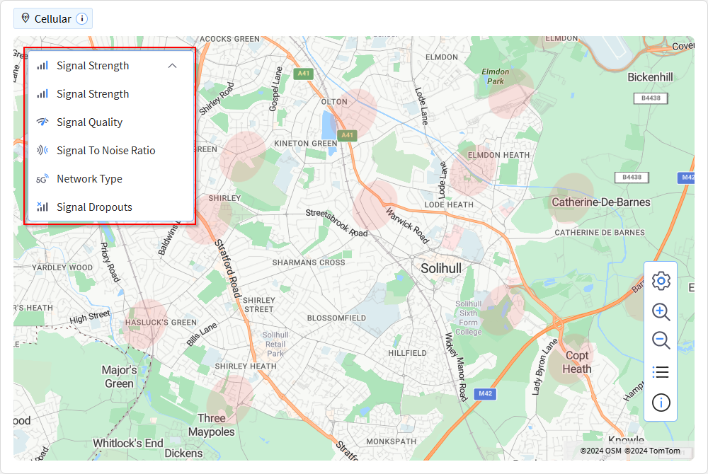
Cellular
The Cellular spotlight displays cellular data for the selected device.
To open the Cellular spotlight:
- Follow steps 1 through 5 in Accessing and Customizing a Device Spotlight.
- Select Cellular in the Device
Spotlight screen.

Map
A map displays showing the relevant cellular signal details for the selected device.
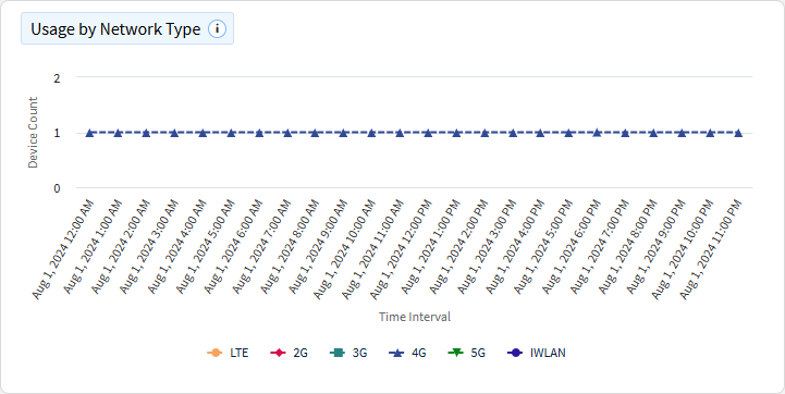
Usage by Network Type
This chart categorizes the devices in your fleet by the type of cellular connection they used over a specific time period. The x-axis represents the timeline (e.g., hourly, daily). The y-axis shows the number of devices connected via each type of cellular network (e.g., 3G, 4G, 5G). Different colors or patterns distinguish the various cellular connection types, making it easy to visualize the distribution and changes in network usage over time.
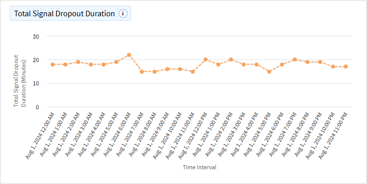
Total Signal Dropout Duration
This chart tracks the total duration of cellular signal dropouts experienced by devices over a specified time period. The x-axis represents the timeline, while the y-axis represents the total duration of signal dropout time.
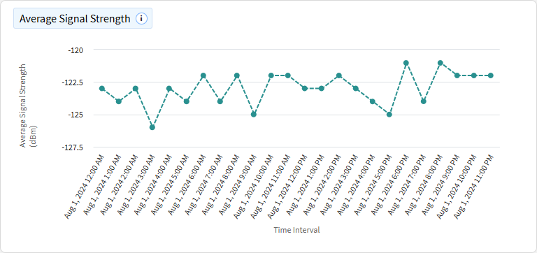
Average Signal Strength
This chart shows the average cellular signal strength experienced by devices over time. The x-axis represents time intervals and the y-axis represents average signal strength, measured in dBm (decibels relative to a milliwatt) for RSRP for 5G and 4G, RSCP and RSSI for 3G, and RSSI for 2G.
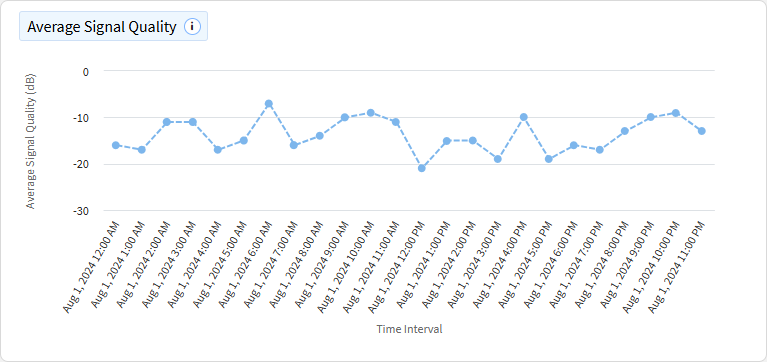
Average Signal Quality
This chart displays the average quality of cellular signals experienced by devices over time. The x-axis represents time intervals and the y-axis representing average signal quality, measured in dB for RSRQ for 5G and 4G, ECNO for 3G, and RXQUAL for 2G.
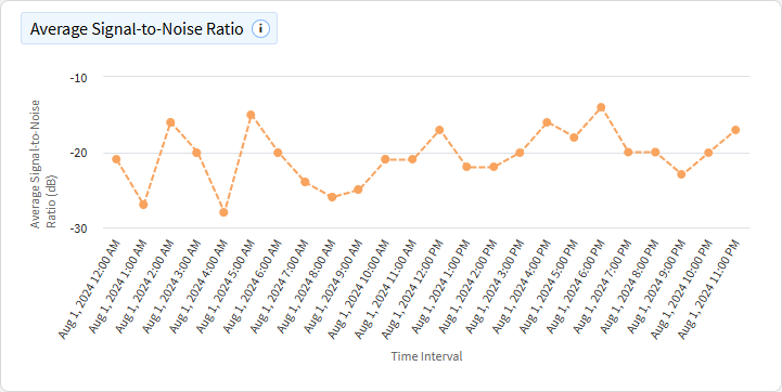
Average Signal-to-Noise Ratio
This chart illustrates the average signal-to-interference-plus-noise ratio (SINR) experienced by devices over time. The x-axis represents time intervals and the y-axis indicates the average SINR, measured in decibels (dB) for 5G and 4G.
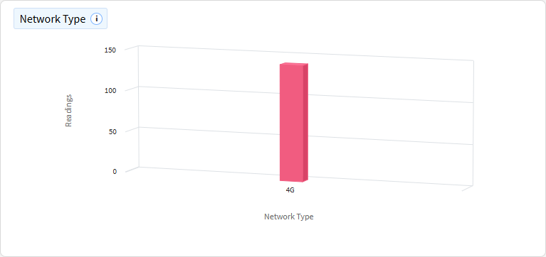
Network Type
This chart categorizes device readings by network type.
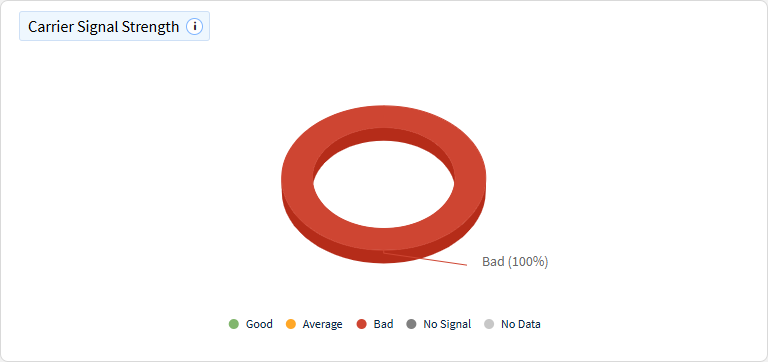
Carrier Signal Strength
This chart shows signal readings categorized by carrier signal strength.
