Building a Visual Board Using Visualization Studio
About this task
With SOTI Connect's Visualization Studio, you can add and configure Visual Board widgets in a drag-and-drop authoring environment. The studio features a large canvas where you can position and edit your widget selections.
Once you have created a Visual Board (as described in Copying a Visual Board and Creating or Importing a Visual Board) you can open it in the Visualization Studio for edit (see Editing or Deleting a Visual Board).
You can add the following device widget types to a Visual Board:
- Sections (to add different shapes into the Visual Board canvas to organize information)
- Actions (for example, to download firmware or print a test label)
- Properties (for example, a serial number or an active IP address)
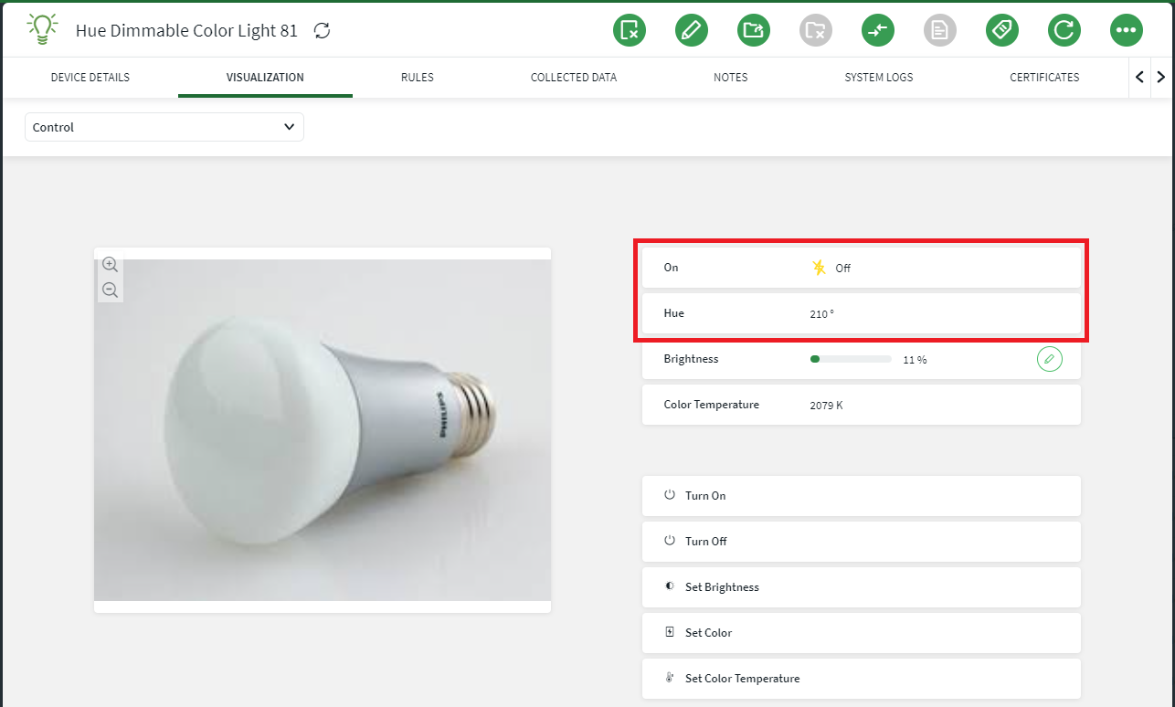
- Images (such as annotated device control panel photos)
- Charts (such as line or bar graphs)
- Gauges (such as Circle or Bar gauges)
Placing Widgets on the Visualization Studio Canvas
Procedure
- From the main menu, select Visual Board.
- Select the New Visual Board icon.
- Select Create a board from the drop-down list.
- Enter a Board Name and select a Device Type.
- Select Next.
- On the New Visual Board screen, select one of the widget selectors from the left-hand menu (Actions, Properties, Images, Charts, or Gauges).
- Browse through the list of widget selections. You can view the full name of the widget by hovering over it with your mouse.
-
Drag and drop the widget onto the canvas. A red box around the widget as
you are placing it indicates you cannot drop the widget in that location. It
would obscure an interactive widget that you have already placed.
Tip: You can place widgets on top of Image widgets to create interactive image carousels.
-
You can manipulate the widgets on the canvas in the following ways:
- You can change the dimensions of larger widgets such as images, charts, and gauges. Select the widget on the canvas and enter new X and Y coordinates or Width and Height values. Alternately, select the widget selection again and adjust with your mouse using the handles:
- Delete or edit a widget by selecting the widget in the canvas, then selecting the Edit or Delete buttons. You can also select multiple widgets and move them in batches:
- Select Update to save changes to your Visual Board. If the Update button is grey and inactive, check the orientation of widgets on the canvas to ensure there is no invalid overlapping of widgets.
Working with Section Widgets
About this task
Procedure
-
Select the Organize widget selector from the
left-hand menu:

- Select the Section widget and drag it onto the canvas.
-
Design the layout of the section widget using the options in the
Section Widget Settings panel.
Use the following information when setting up a section widget:
- A section widget can be vertical or horizontal and can have a maximum overall size of 12 slots.
- You can choose 4 or 8 slots instead of the maximum 12 slots, to reduce the section widget size to 1/3 or 2/3 of the maximum size respectively.
- Whichever overall size you choose for your section widget, you must
fill all slots using any combination of the following slot types:
- Big Slot: 1 big slot occupies 4 section widget slots.
- Medium Slots: 2 medium slots occupy 4 section widget slots.
- Small Slots: 4 small slots occupy 4 section widget slots.
- Half Small Slots: 8 half small slots occupy 4 section widget slots.
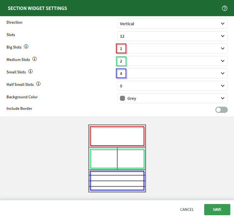 The screen shot above shows the creation of a 12 slot vertical section widget. The red boxes represent the use of 1 big slot. The green boxes represent the use of 2 medium slots. The blue boxes represent the use of 4 small slots.
 -
Select Save.
Note: You must fill all slots in the section widget. The Save button remains grayed-out until you fill all slots in the section widget.
-
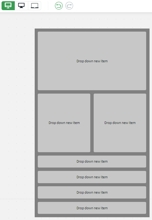
In the New Visual Board screen, the section widget
displays on the canvas, ready for you to add actions, properties, images,
charts, and gauges.
-
Add widgets from the actions, properties, images, charts, and gauges
categories on the left. Drag any of the available widgets from any of the
categories into any of the empty slots in the section widget.
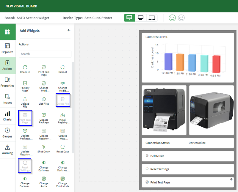 The section widget has been fully populated with a chart, images, a property (connection status) and actions (delete file, reset settings and print test page).Note: You can only use a widget once per canvas. Widgets that are already used are grayed-out (blue boxes).Note: When dragging widgets, the widgets take on a shape. The shape of the dragged widget must fit the shape the shape of the target section in the section widget.Tip: You can add multiple section widgets to the visual board canvas.
Results
Working with Device Actions Widgets
Procedure
-
Select the Actions widget selector from the
left-hand menu:

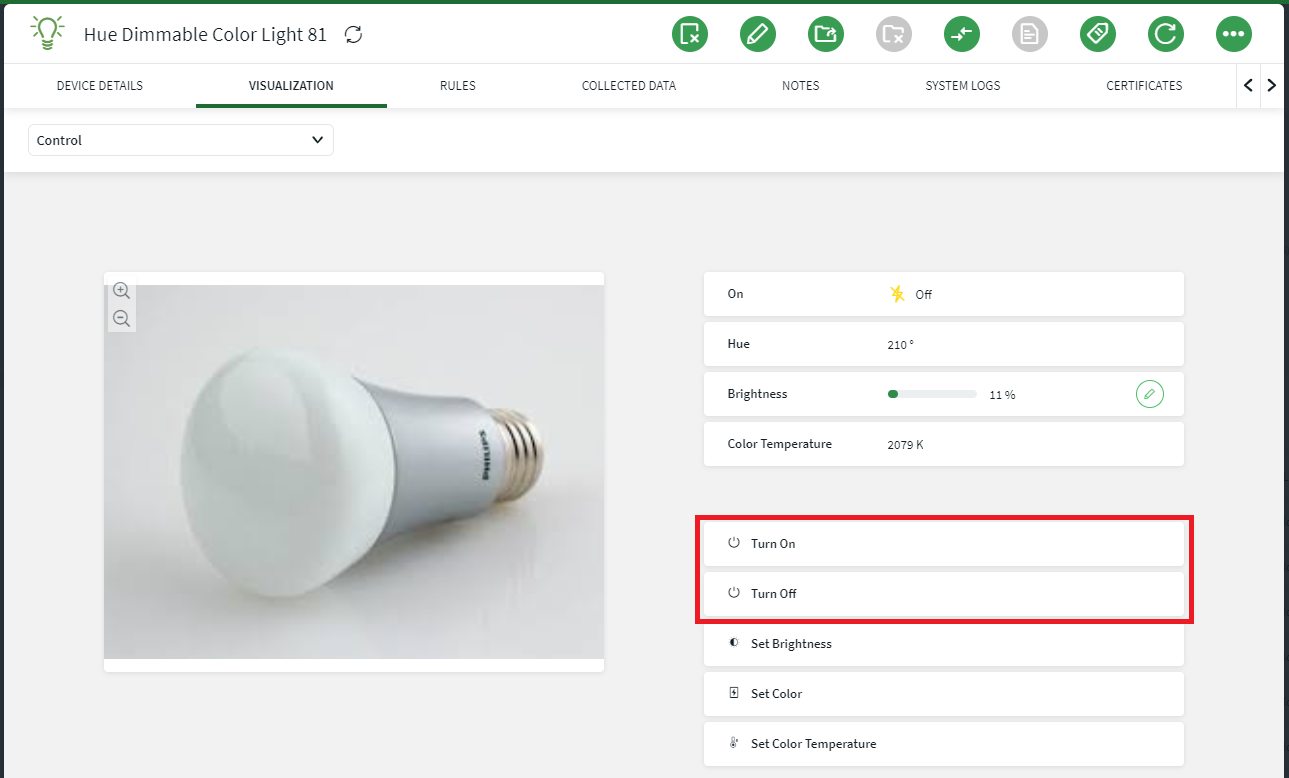
- Browse the list of available actions for the device type you selected when you created the Visual Board. For more general information, see Using Device Actions.
- Drag and drop your desired action onto the canvas.
-
Select Update.
Note: When adding a device action widget, the device specific icon displays in the widget if the action is specific to the device.
Results
Working with Device Properties Widgets
Procedure
-
Select the Properties widget selector from the
left-hand menu:

- Browse the list of available properties for the device type you selected when you created the Visual Board.
- Drag and drop your desired property onto the canvas.
-
Select Update.
Note: When adding a device property widget, the device specific icon displays in the widget if the property is specific to the device.
Results
Working with Images Widgets
Procedure
-
Select the Images widget selector from the left-hand
menu:

-
Browse through the collection of images for the device type you selected
when you created the Visual Board, or upload custom images by selecting
 Upload Device Image. SOTI
suggests uploading high-resolution images (720p and greater) to support
zooming and scaling.
Upload Device Image. SOTI
suggests uploading high-resolution images (720p and greater) to support
zooming and scaling.
- Drag and drop an image onto the canvas.
- Select Update.
Explore the carousel feature of image widgets where you can add multiple images to
a single place on the visual board canvas.
-
If you have multiple images of a device (for example, different views of
the same printer), drag the images on top of the first one to establish an
image carousel. The image carousel allows you to scroll left or right to
view the multiple images.
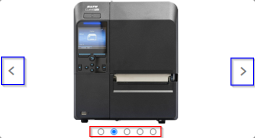 In the screen shot above, the red box shows that the image carousel contains five images and the second of the five images is on display. The blue boxes show the left and right icons used to scroll to the other images in the carousel.Note: The carousel feature is available for image widgets placed on the visual board canvas or image widgets placed in a section widget.
Results
Working with Charts Widgets
Procedure
-
Select the Charts widget selector from the left-hand
menu:

-
Three charts are available for your Visual Board: Line, Bar, and Donut.
Drag and drop a chart type onto the canvas, then configure the charts in the
Chart Widget Settings screen to display the desired
information:
Option Description Line Chart - Property: Select the device property that you want to measure in the line graph. For example, for a printer you might choose Inches to monitor how many label inches a printer outputs over a time period.
- Number of Buckets: Set the total number of time periods you want displayed on your graph's X axis. For example, if you select Months as the Interval for your graph, and 5 as the Number of Buckets, five months is displayed on the X axis.
- Interval: Select the time interval you want to capture in your graph. For example, Hours, Weeks, or Months.
Bar Chart - Property: Select the device property that you want to measure in the bar graph. For example, for a printer you might choose Cuts to monitor how many label cuts a printer performs over a time period.
- Number of Buckets: Set the total number of time periods you want displayed on your graph's X axis. For example, if you select Months as the Interval for your graph, and 5 as the Number of Buckets, five months is displayed on the X axis.
- Interval: Select the time interval you want to capture in your graph. For example, Hours, Weeks, or Months.
- Value Type: Select either the Average Value or the Latest Value to appear in your bar graph.
Donut Chart - Property: Select the device property that you want to measure in the donut graph. For example, for a printer you might choose Cuts to monitor how many label cuts a printer performs over a time period.
- Number of Buckets: Set the total number of time periods you want displayed on your graph's X axis. For example, if you select Months as the Interval for your graph, and 5 as the Number of Buckets, five months is displayed on the X axis.
- Interval: Select the time interval you want to capture in your graph. For example, Hours, Weeks, or Months.
- Number of Segments: Set the total number of segments displayed in your donut chart.
- In the Chart Widget Settings screen, select Save to add your chart to the Visual Board.
Results
Working with Gauges Widgets
Procedure
-
Select the Gauges widget selector from the left-hand
menu:

-
Two gauges are available for your Visual Board: Circular, and Bar. Drag and
drop a gauge type onto the canvas, then configure the gauges in the
Gauge Widget Settings screen to display the desired
information:
Option Description Circular Gauge - Property: Select the device property that you want to measure in the circle gauge. For example, for a printer you might choose Inches to monitor how many label inches a printer outputs over a time period.
- Minimum Value: Set the minimum value you want displayed in your gauge. This value appears on the far left side of the circle image.
- Maximum Value: Set the maximum value you want displayed in your gauge. This value appears on the far right side of the circle image.
- Gauge Skin: Choose the visual style of your gauge. Half Circle Gauge shows the measurement as a half-circle filling up, while Needle Gauge uses a needle indicator to show the measurement, like a speedometer or pressure gauge.
Bar Gauge - Property: Select the device property that you want to measure in the bar gauge. For example, for a printer you might choose Cuts to monitor how many label cuts a printer performs over a time period.
- Minimum Value: Set the minimum value you want displayed in your gauge. This value appears on the far left side of the bar image.
- Maximum Value: Set the maximum value you want displayed in your gauge. This value appears on the far right side of the bar image.
- In the Chart Widget Settings screen, select Save to add your chart to the Visual Board.